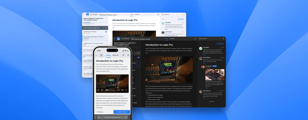
Masterstudy LMS Plugin v3.1.0: Making Students’ Learning Better and Easier with the Course Player
Version: 4.8.17 October 10, 2023Attention, fellow educators and learners! We’ve got some news to share about our Masterstudy WordPress plugin, and we’re eager to spill the beans. At Stylemixthemes, we want to give cutting-edge solutions for educators and learners alike.
So this year, we’ve made a major update to ease the way you create courses. But we didn’t stop there – with your feedback we decided it was time to upgrade the Course Player in the Masterstudy plugin. Let’s dive into what’s new and exciting!
So, What’s New?
Earlier this year, we spruced up our Course Builder, a tool that lets you create courses, lessons, quizzes, and more. After rolling out that update, we heard from you, our awesome users.
You know how you’ve been telling us that you’d like to enhance how your students see and engage with your courses? Well, we’ve been all ears. We love hearing from you because it helps us make our products even better.
We rolled up our sleeves, did a bunch of UX research, and poured our hearts into the new Course Player.
But what exactly is this “Course Player” we’re talking about?
It’s the view and experience your students get when they enroll in a course.
Updates in the Course Player
A New Interface
When your students enroll in a course, they’ll notice a brand-new interface in the Course player. It’s sleek, clean, and designed to cut distractions. 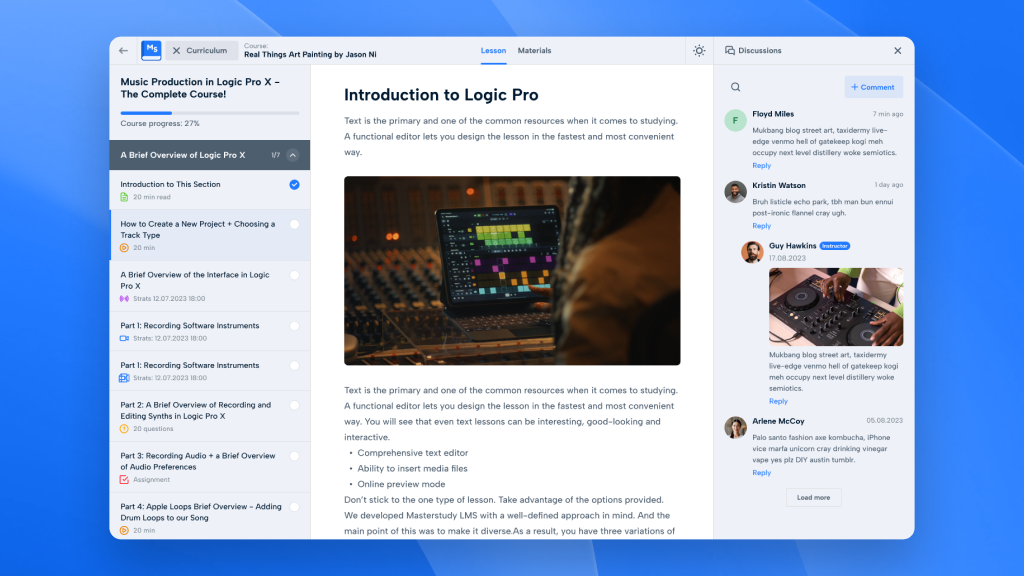
Plus, here’s the best part – when they return to the course later on, they’ll pick up right where they left off. No more hunting for the last thing they were studying!
Up at the top, in the header, students will see the name of your course and a curriculum button (it’s like your course map). There is also an icon to switch between light and dark modes and an expandable discussions button.
The discussions button makes learning better as students can chat about it. They can also expand that curriculum button with a click when they need it, or tuck it away when they want to laser-focus on your lesson.
Getting to your lessons is easy for your students. Once they have completed a lesson, they can click on the “Complete” button down at the bottom of the page to go to the next one.
It’s all about giving them the best tools to ace your lessons!
Light and Dark Themes
Everyone has their own preferences, right? That’s why there are light and dark themes in the Course player. Your students can pick the one that suits their mood or surroundings with a simple click. 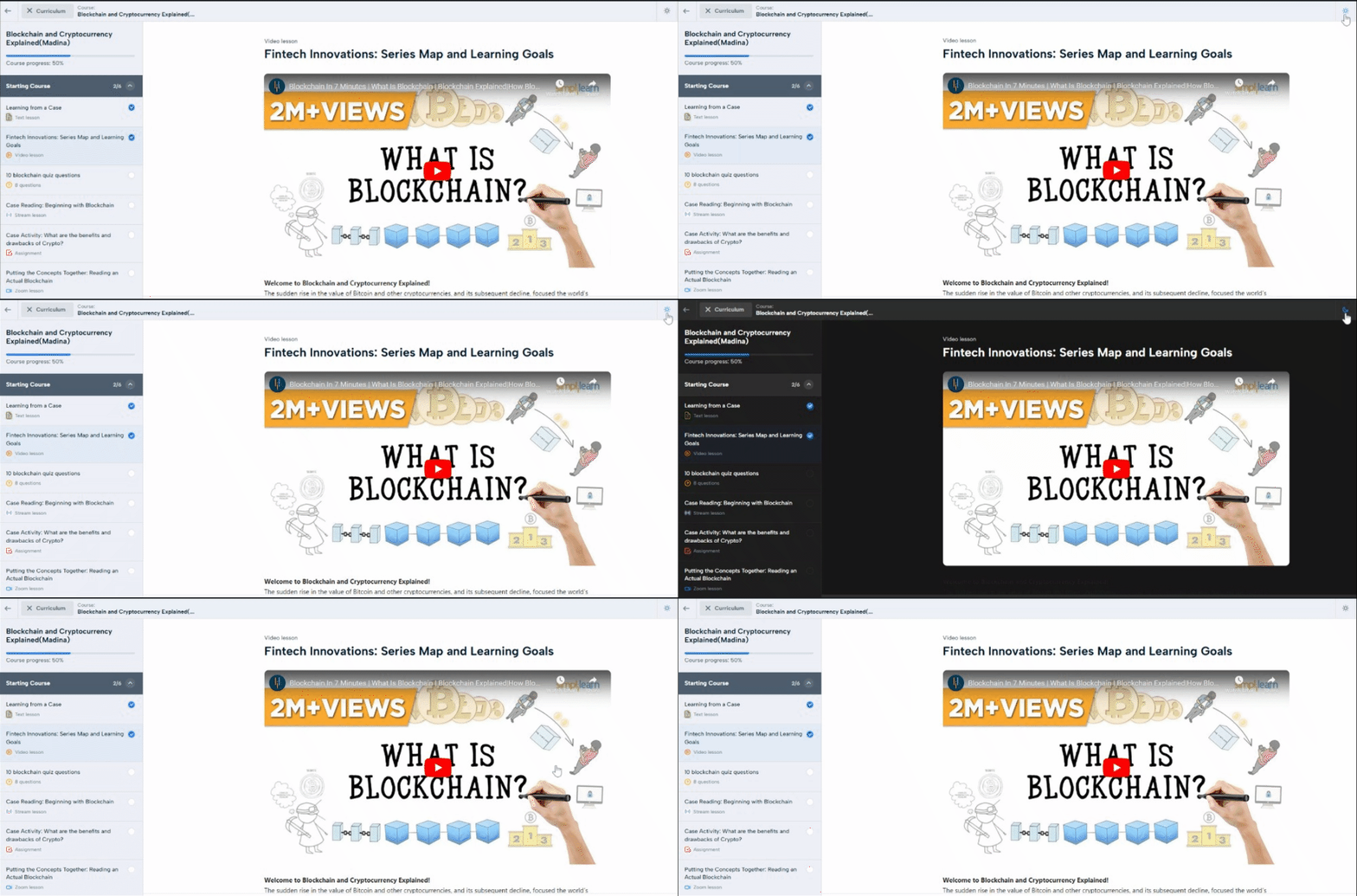
Admins can actually set the default theme for everyone. To do that head over to LMS Settings and find the Course Player section. You can switch the Lesson page default theme from Light to Dark, or vice versa, depending on what tickles your fancy. It’s all about making your learning space feel just right.
Better Navigation
Let’s talk about the navigation panel. We’ve made some nifty changes to help your students find their way more smoothly. Navigation is that top panel with Curriculum, Discussions, Light and Dark modes. 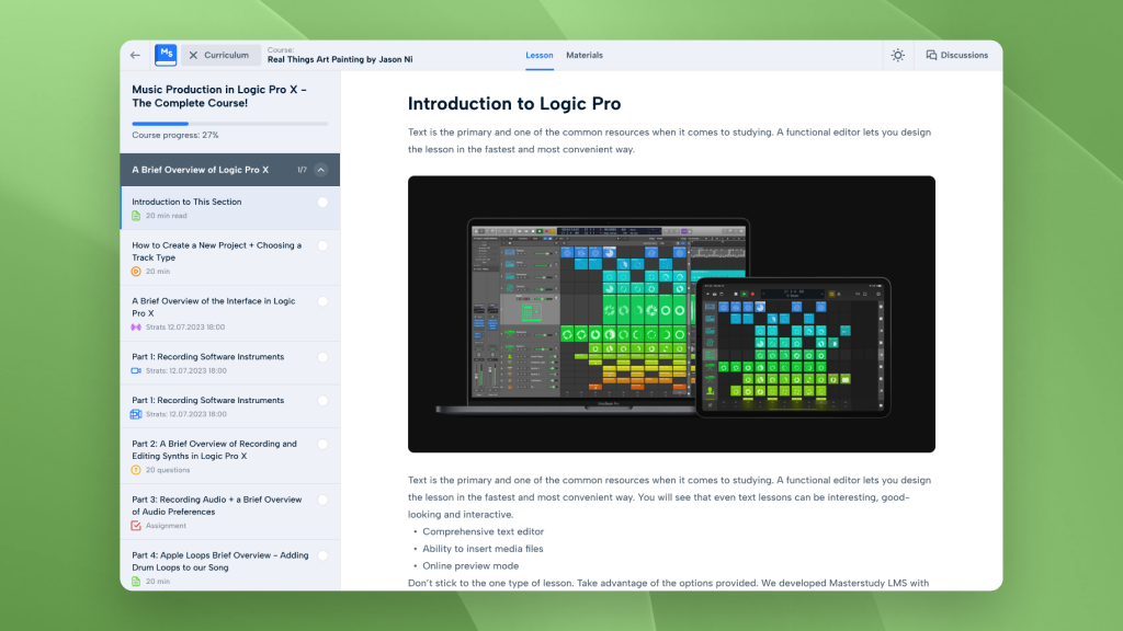
We’ve made sure it’s right where students need it for easy access. Plus, we’ve given the content area a little extra space, so you’ve got plenty of room to move around comfortably.
Enhanced Mobile UX
Let’s talk about user experience (UX). It can make or break your interaction with an online platform. And we get it – everyone wants a seamless experience, whether they are using a laptop or smartphone.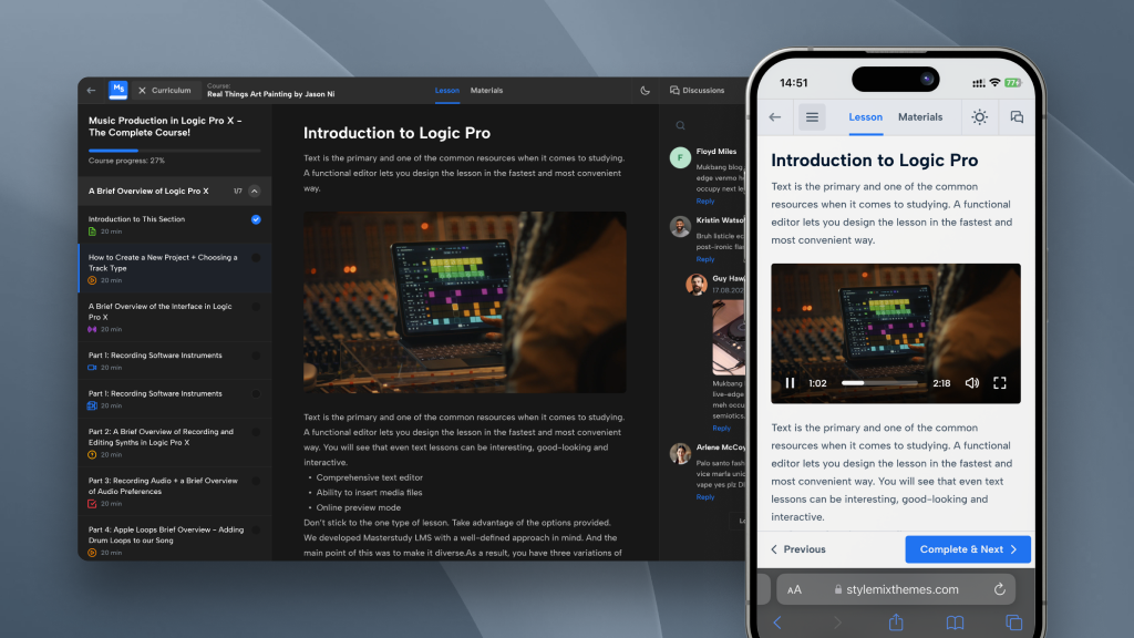
So, here’s the scoop: We’ve taken our mobile view to the next level for a top-notch experience. It’s not just about fitting the content on a smaller screen. But it’s about optimizing every aspect for mobile users.
We’ve fine-tuned the interface and navigation so that your LMS on a mobile device feels like a breeze. We’ve paid attention to every detail; the layout is intuitive and the buttons are easy to tap. Your students won’t be sacrificing anything when they access your LMS on smartphones.
Question Types
We’ve made improvements to our question types: Item Match and Image Match. So they are super user-friendly, responsive, and clean. But why just talk about it when we can show you? Let’s take a peek at how the “Item Match” and “Image Match” question types look now! 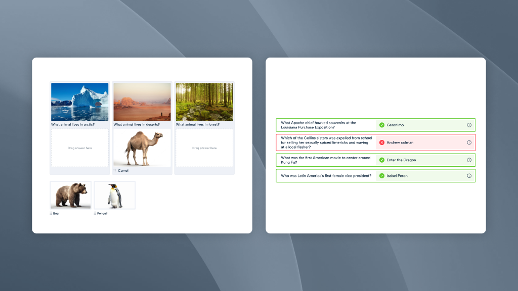
Curious to see how the other parts of our Masterstudy plugin have improved? Go to our live demo and explore more.
Let’s wrap it up
We’re all about making your and your students’ experience as smooth as possible. And these updates are the beginning. So, get ready for a more enjoyable and user-friendly journey as you use our Masterstudy plugin for your LMS and courses.
Try all updates now and we’d love to hear your thoughts and feedback on these improvements. And stay tuned because we’ve got more exciting improvements coming soon!
