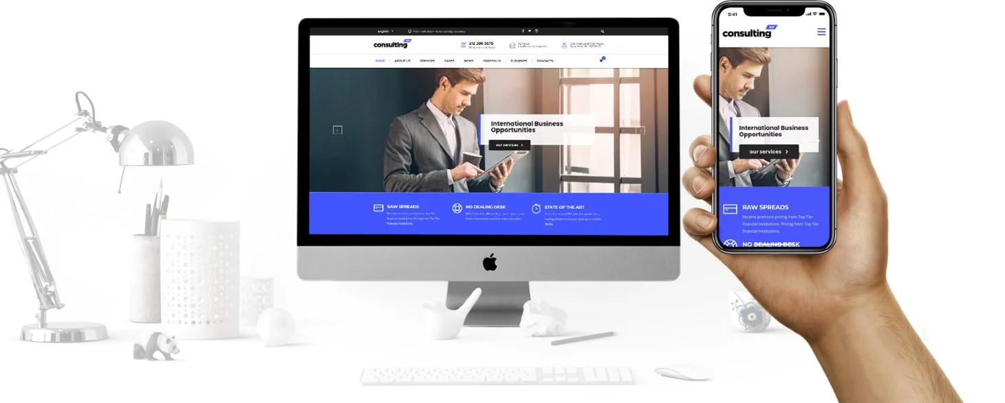
Mobile first
The world is becoming mobile, and Consulting is fully compatible with Google’s Mobile First Standard.
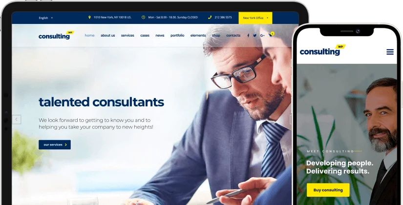
Focused on responsive design
Our mobile visibility system is really incredible.
It is based on 3 screen sizes: small, medium, large and each size one has a global theme option for you to set the exact point at which it should display. Then, each Visual Composer Element has a button set that allows you to choose if the element displays on each screen size.
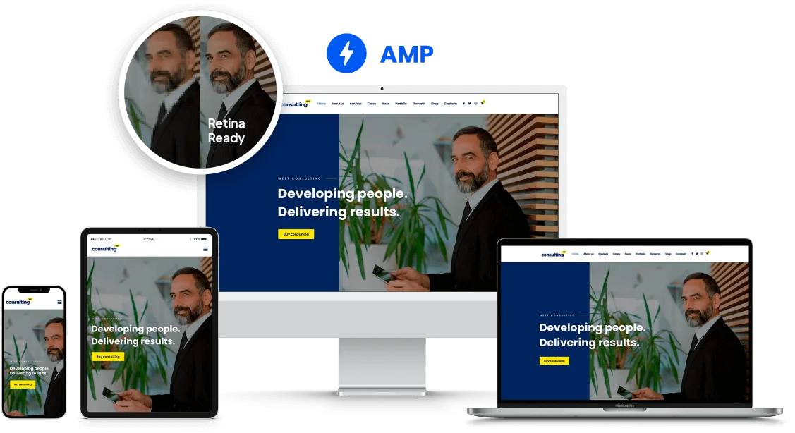
Consulting is retina ready!
The theme is 100% Retina Ready and will look absolutely fantastic on high-resolution displays. Also, Consulting is AMP Theme. AMP allows it to be displayed fast and crispy on any mobile device.
by StylemixThemes.