MasterStudy V 4.3.2: Updated user profile and the improved navigation menu
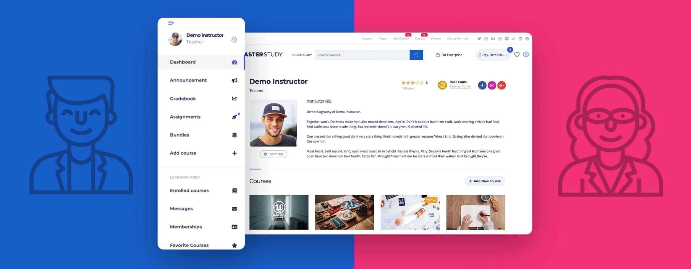
Version: 4.3.2 June 10, 2021Meet the updated user profile. Better navigation, improved menu, and superior user experience.
The Profile page is now equipped with a sticky floating navigation menu. Through the menu, the user gets access to the required part of the site enjoying the improved navigation and performance.
More about the floating menu
You can enable and disable the floating menu. Also, it can be turned on for both authorized and unauthorized users.
As an authorized user instead of the detailed long menu, the user will see the log-in section and course categories. Once logged into the account, depending on the user role the user will see a relevant menu type.
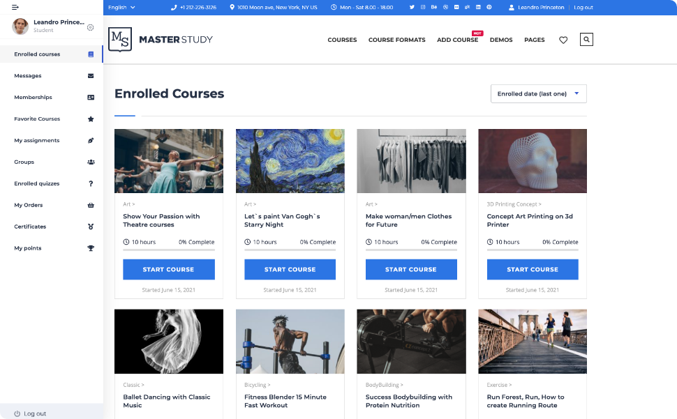
Student profile
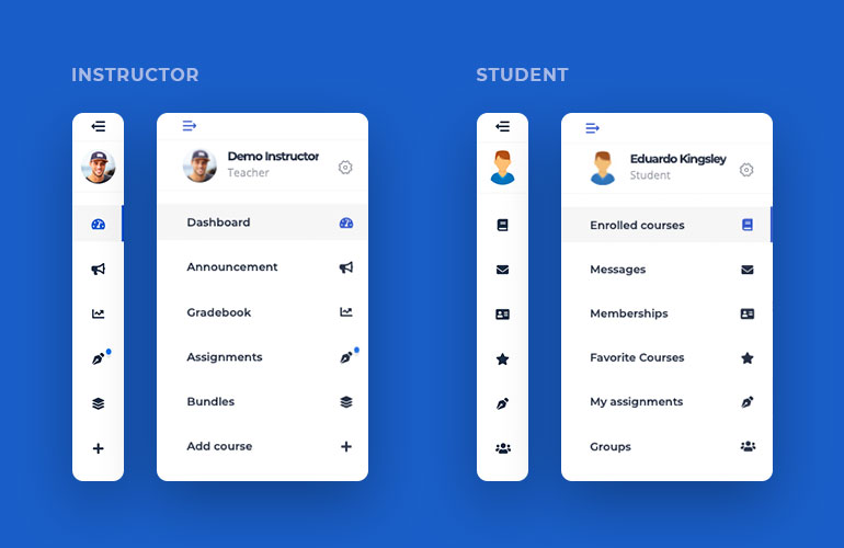
Students get access to everything they need via the menu. This navigation toolbar always stays visible on the page and connects learners with the enrolled courses, messages, certificates, groups, etc.
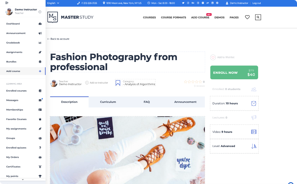
Teacher profile
Unlike the students, instructors have an extended user navigation panel. The fact that instructors can also be students on the platform and take courses themselves, affected the appearance of the menu. In other words, the menu on the instructor’s profile page has two sections with options related to both student’s and teacher’s activities. It makes the navigation more convenient and allows to keep everything on one page with accurate separation.
Menu appearance
- The menu can be collapsed and expanded.
- It is sticky and is always visible on the page.
- You can place it on either side of the page — right and left.
- You can control its display and disable it or enable it for authorized users only.
We hope that the updated user profile and menu will make your experience better and improve the navigation.
To learn more please see the documentation article.


