Imagine this: you’re cruising through a website, looking for something specific. Suddenly, you stumble upon a contact form or pricing calculator with a range of services and costs. It’s like a little invitation, saying, “Hey, drop us a line!” Fillable forms are more than just boxes to type in; they’re your direct line of communication with your visitors.
Here’s the deal: fillable forms make it super easy for your audience to reach out to you. And you can even sell your services without getting in touch with the customers. Whether they have a question, want to sign up for updates, or simply purchase the products, a fillable form is their go-to tool. It’s like having a virtual suggestion box right on your website!
Content Outline
- Overview of the Benefits of Having Fillable Forms
- Types of information commonly collected through fillable forms.
- Tips and Best Practices for Designing User-Friendly Forms
- How to Tailor Forms to Match the Branding and Style of Your Website
- Methods for Embedding Fillable Forms into Different Website Platforms
- Conclusion
Overview of the Benefits of Having Fillable Forms
Now, let’s talk about the perks of having fillable forms or online calculators on your website. First off, they’re incredibly convenient. Instead of having to hunt down your email address or phone number, visitors can simply type their message into a form, make a purchase, and hit send. So easy and quick!
Pricing forms also help you collect valuable information from your audience. Whether it’s feedback on your products or demographic data for marketing purposes, fillable forms are your ticket to gathering insights straight from the source.
Plus, let’s not forget about the professional touch fillable forms add to your website. They show that you’re organized, responsive, and ready to engage with your audience. And trust me, that kind of impression goes a long way in building trust and credibility online.
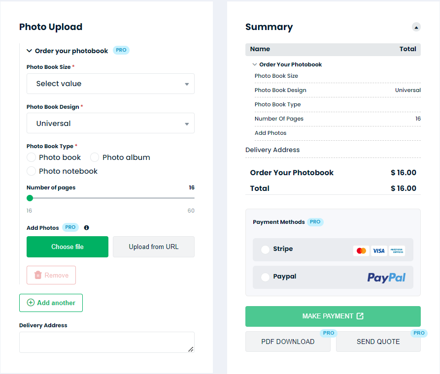
The forms may seem small, but they pack a mighty punch when it comes to enhancing your website’s functionality and user experience. Ready to dive in and create your own? I will show you a nice example.
Types of information commonly collected through fillable forms
Now that we’ve covered why fillable forms are awesome, let’s dive into the nitty-gritty of what kind of information you can actually gather with them. Trust me, it’s more than just names and email addresses!
- Contact Information: This one’s a no-brainer. Fillable forms are perfect for collecting basic contact details like names, email addresses, phone numbers, and mailing addresses. Whether it’s for inquiries, subscriptions, or registrations, having this info handy makes it easy to stay in touch with your audience.
- Feedback and Suggestions: Ever wonder what your customers really think about your products or services? Fillable forms are your ticket to finding out! You can create surveys, feedback forms, or suggestion boxes to gather valuable insights directly from your audience. From product improvements to new feature ideas, the possibilities are endless!
- Order and Reservation Requests: If you’re running an e-commerce site or offering services, fillable forms can streamline the ordering and reservation process. Customers can easily submit their requests for purchases, bookings, appointments, or reservations right from your website. It’s like having a virtual assistant taking care of business 24/7!
- Event Registrations: Planning an event? Fillable forms are your best friend! You can create registration forms to collect attendee information, RSVPs, dietary preferences, and more. Plus, with automated confirmation emails and reminders, managing event registrations has never been easier.
- Newsletter Subscriptions: Building an email list is crucial for staying connected with your audience and driving engagement. With fillable forms, visitors can sign up for your newsletter or updates with just a few clicks. It’s a win-win: they get valuable content delivered straight to their inbox, and you get to nurture those leads over time.
- Job Applications: If you’re hiring, fillable forms can streamline the job application process for both applicants and recruiters. Candidates can submit their resumes, cover letters, and other required documents online, making it easy for you to review and manage applications efficiently.
Tips and Best Practices for Designing User-Friendly Forms
Now that you’re ready to dive into creating fillable forms for your website, let’s make sure they’re not just functional, but user-friendly too! After all, nobody likes filling out a form that feels like a chore. Here are some tips to keep things smooth sailing:
- Keep it Simple: Ain’t nobody got time for complicated forms! Stick to the essentials and only ask for information that’s absolutely necessary. The fewer fields to fill out, the better. Remember, brevity is the soul of wit (and good form design)!
- Use Clear Labels: Make sure each form field has a clear and descriptive label. Avoid jargon or technical language that might confuse your visitors. Keep it simple and straightforward so they know exactly what to fill in.
- Organize and Group Fields: Group related fields together to create a logical flow. For example, put all the contact information fields (like name, email, and phone number) together in one section. This makes it easier for users to navigate and understand the form.
- Provide Helpful Instructions: If a field requires specific formatting (like a phone number or date), provide clear instructions on how to input the information. You can use placeholder text or tooltips to give users guidance without cluttering up the form.
- Use Smart Defaults: Where possible, pre-fill form fields with default values to save users time. For example, if you’re asking for a country or state, use auto-complete or dropdown menus to suggest options based on the user’s location.
- Mobile Optimization: Don’t forget about your mobile users! Make sure your forms are fully responsive and optimized for smaller screens. Use larger text and buttons, and avoid tiny form fields that are hard to tap on a touchscreen.
- Visual Design: A little bit of design goes a long way! Use colors, spacing, and typography to make your form visually appealing and easy to scan. But remember, simplicity is key—don’t go overboard with fancy graphics or distracting elements.
- Error Handling: Nobody’s perfect, and neither are form submissions! Make sure your form has clear error messages and validation checks to catch any mistakes before they’re submitted. And when errors do occur, be kind and helpful in guiding users on how to fix them.
- Test, Test, Test: Last but not least, always test your forms before going live. Try filling them out yourself (and maybe recruit a few friends or colleagues to do the same) to make sure everything works smoothly and as expected.
How to Tailor Forms to Match the Branding and Style of Your Website
You’ve got your fillable forms all set up and ready to roll, but now it’s time to take things to the next level: customization! Let’s make sure your forms not only function like a dream but also look like they belong on your website. Here’s how to tailor them to match your branding and style:
- Color Scheme: Start by choosing colors that align with your website’s branding. Use your brand’s primary colors for the form background, text, buttons, and accents. Consistency is key here—keeping your colors cohesive will create a seamless experience for your users.
- Typography: Pay attention to the fonts you use in your forms. Stick to the same font styles and sizes that you use throughout your website to maintain visual harmony. Whether it’s sleek and modern or classic and elegant, your typography should reflect your brand’s personality.
- Logo Integration: Incorporate your logo into your forms to reinforce brand recognition. You can place your logo at the top of the form or use it as a watermark in the background. Just make sure it’s visible but not too distracting.
- Custom Graphics: Add custom graphics or illustrations to your forms to give them a unique touch. This could be subtle background patterns, icons next to form fields, or decorative borders. Just make sure the graphics complement your overall design aesthetic.
- Consistent Layout: Keep your form layout consistent with the rest of your website. Use the same spacing, alignment, and padding to maintain a cohesive look and feel. Consistency in design not only looks professional but also makes your forms easier to navigate.
- Responsive Design: Don’t forget about mobile users! Make sure your forms are fully responsive and adapt seamlessly to different screen sizes. Test your forms on various devices to ensure they look and function flawlessly across the board.
- Personalization Options: Consider adding personalization options to your forms, such as custom fields or dropdown menus tailored to your audience’s preferences. This not only enhances the user experience but also strengthens your brand’s connection with your visitors.
- Accessibility: Last but not least, prioritize accessibility in your form design. Use clear, easy-to-read fonts, provide sufficient color contrast, and ensure interactive elements are keyboard accessible. Everyone should be able to use your forms, regardless of their abilities.
By following these tips and tricks, you’ll be able to tailor your fillable forms to perfectly match the branding and style of your website. So go ahead, get creative, and let your brand shine through in every form submission!
Methods for Embedding Fillable Forms into Different Website Platforms
Now that you’ve got your beautifully customized fillable forms all set up, it’s time to get them out into the world—or rather, onto your website. But how do you actually embed them into your site? Don’t worry, I’ve got you covered. Here are some methods for embedding fillable forms into different website platforms:
- WordPress:
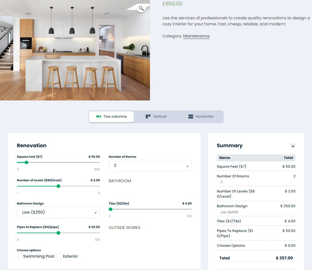
- Using Plugins: WordPress offers a variety of plugins that make embedding forms a breeze. Popular options include Cost Calculator, Contact Form 7, and Gravity Forms. They are free.
For example, with Cost Calculator you can create any form on any page of your website – let’s build one for graphic designers. Create a blank form after uploading it on your WordPress website and turn on an Order form and settings Show Summary with calculations after adding contact info and Show calculations on Summary block. This will create an automatic form to get all contact information like a name, email and number without payments.
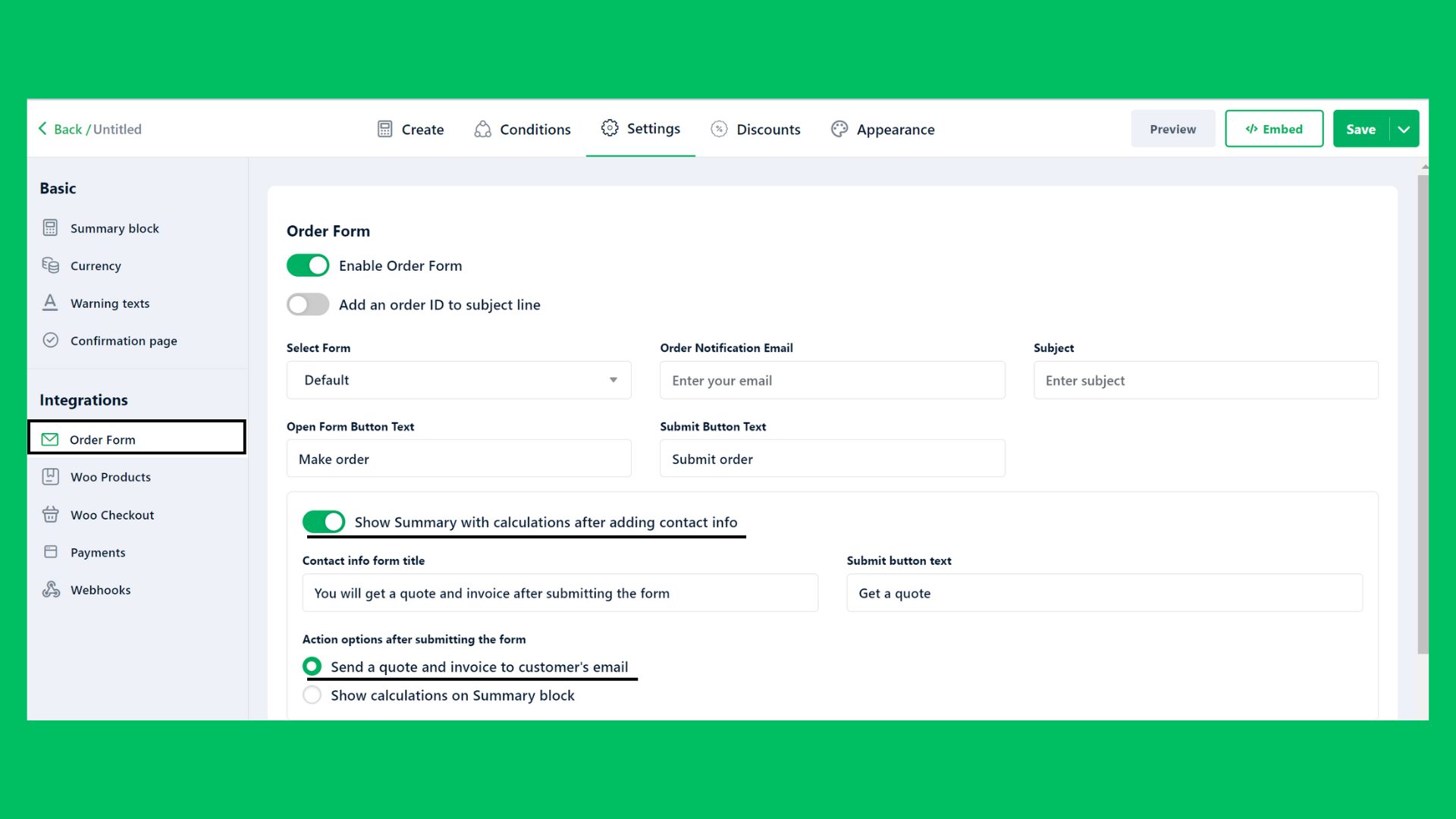
Then go back to the builder, and add all form questions you want to ask your visitors. I used these elements and questions to build a calculator:
- Validated form for the question “Can you provide your company website?”
- Checkbox for the question “What type of design work do you need? (Select all that apply)”
- Text for the question “Can you give us more details about the project?”
- Radio for the question “Do you have any existing brand guidelines or assets? (e.g., logos, color schemes, fonts)”
- File Upload for the question “If yes, please upload them” with Conditions. You can use Conditions when you want to show specific questions based on the visitor’s choice; in our case, this question will show up if a visitor chooses Yes on a previous question.
- Text for the question “What is your preferred style or aesthetic? (Provide examples if possible)”
- Text for the question “Who is your target audience?”
You can see below the form for graphic designing projects with the Cost Calculator plugin inserted with a shortcode.
You can customize the form within the Appearance tab by changing the typography, layouts, colors, etc.
- HTML Embed Code: If you prefer more control over the form’s appearance and functionality, you can generate the HTML embed code for your form and add it directly to your WordPress website. Most form builder platforms provide this option, allowing you to paste the code into a custom HTML block within the WordPress editor.
- Wix:
- Built-in Form Builder: Wix has its own built-in form builder that allows you to create and customize forms directly within the platform. Simply drag and drop form elements onto your page, customize the design to match your site’s style, and publish your form with a click.
- HTML Widget: If you’re using a third-party form builder or have custom HTML code for your form, you can use Wix’s HTML widget to embed it into your website. Simply add the widget to your page, paste the HTML code, and your form will appear seamlessly within your Wix site.
- Squarespace:
- Form Blocks: Squarespace offers form blocks that allow you to easily add forms to your pages. Simply drag and drop the form block onto your page, customize the fields and design, and publish your changes.
- Code Injection: For more advanced customization options or if you’re using a third-party form builder, you can use Squarespace’s code injection feature to add your form’s HTML code directly into your site’s header or footer. This gives you full control over the form’s appearance and functionality.
- Shopify:
- Apps: Shopify offers a variety of form builder apps in its app store, such as Form Builder ‑ Contact Form and Form Builder with File Upload. Simply install the app, create your form, and add it to your store’s pages or product pages.
- Customization with Liquid: For more advanced users, you can customize your forms using Shopify’s Liquid templating language. This allows you to integrate form functionality directly into your theme’s files for a seamless user experience.
- Custom Websites (HTML/CSS/JavaScript):
- Embedding HTML Code: For custom-built websites, you can embed your fillable form by generating the HTML embed code from your form builder platform and adding it directly into your website’s HTML code. This gives you full control over the form’s appearance and functionality.
- Using JavaScript Libraries: If you need more dynamic form functionality or interactivity, you can use JavaScript libraries like jQuery or React to enhance your forms. These libraries allow you to create custom form behaviors and validate user input in real time.
By using these methods, you’ll be able to seamlessly integrate your fillable forms into any website platform, ensuring a seamless user experience for your visitors. So go ahead, pick your platform, and let’s get those forms embedded!
Conclusion
Let’s take a moment to recap why creating pricing forms for free is such a game-changer for your website. First off, it’s all about accessibility. By offering fillable forms, you’re making it easier than ever for your visitors to engage with you. Whether they’re reaching out with questions, signing up for updates, or providing feedback, fillable forms streamline the process and encourage interaction.
But that’s not all—fillable forms also open up a world of possibilities for collecting valuable information. From basic contact details to detailed feedback and everything in between, fillable forms give you insights straight from the source. Plus, with the right customization options, you can tailor your forms to match your branding and style, reinforcing brand recognition and trust.
And let’s not forget about the cost savings. Creating fillable forms for free means you can invest your resources elsewhere, whether it’s in growing your business or enhancing your website in other ways. With the abundance of free tools and platforms available, there’s no need to break the bank to create professional-looking forms that get the job done.
So there you have it—the benefits of creating fillable forms for free are clear. They boost accessibility, gather valuable insights, reinforce branding, and save you money. What’s not to love? So go ahead, get creative, and start creating fillable forms that take your website to the next level!




I want to make a unfill form
Hi, Ashar
Thank you for your comment.
We recommend you to use the Cost Calculator to create unfilled forms: https://stylemixthemes.com/cost-calculator-plugin/
In the builder, you can add fields without preset values and mark certain fields as required in your unfilled form.