


If you’ve built calculators in 3.x, this release isn’t a coat of paint. We rebuilt the plugin from the ground up because a modern foundation finally gave us the room to fix the things that bugged us, and you – for years.
Live editing – and goodbye Preview button
Before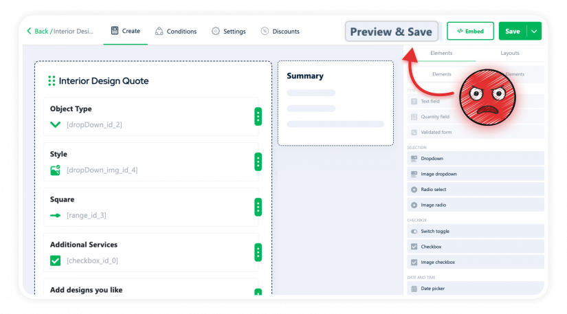
Every time you changed a label, you clicked Preview. Every spacing tweak – Preview. Every new field – Preview. The builder showed abstract placeholders, not the actual calculator. So you were building blind, clicking Preview every few seconds just to confirm reality matched what was in your head.
Fifty times per calculator. Easy.
After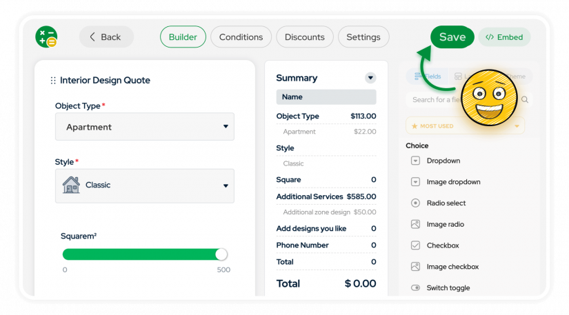
The builder finally shows you what your calculator actually looks like. Not placeholders. Not “roughly.” Not “you’ll see after clicking Preview.” The real thing. Fonts, colors, spacing, field styles – everything matches the live site.
Edit, done.
No more Save on every tiny change
Before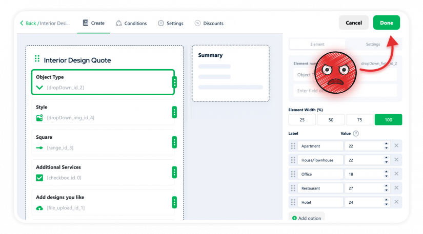
Edit a label. Forget to click Done. Click anywhere else. Lose the change. Try again. Click Done. Then global Save. Then remember Save again for the next field.
Saving. Every. Single. Change. Forget once – lose work.
After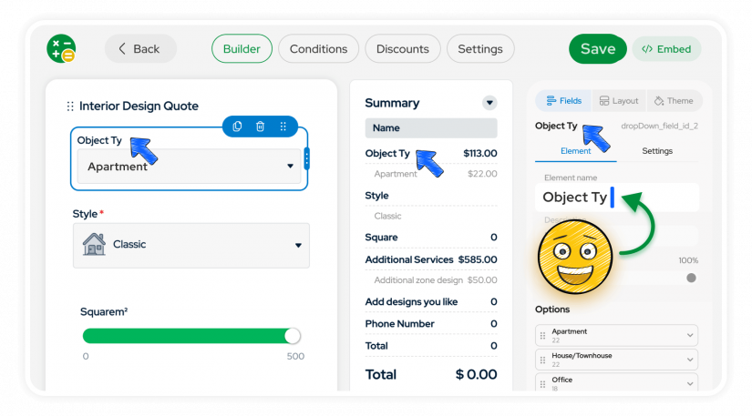
You tweak a label – it applies. Move a field – it applies. Change a color – applies. The only Save is the global one in the header, and it actually tells you what’s going on:
Saved, Unsaved, Saving. Plus Undo and Redo, because humans.
Summary layout is yours
Before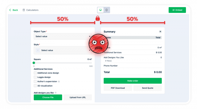
Your Summary had three rows? Tough – it still took half the screen. Your Calculator had twenty fields? Tough – Summary still took half. The 50/50 was the rule, and there was no way to rebalance it.
After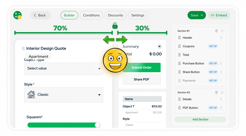
Pick the proportion that fits your business. Details-heavy calculator with a compact summary – 70/30. Rich summary with a short form – 30/70. Mobile-first with summary at the bottom – bottom stack. All without code.
The rigid 50/50 is officially retired.
Drag fields wherever you want
Before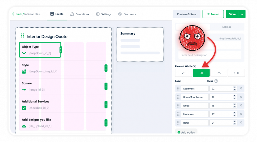
Two short fields side by side? You got 50/50 with huge margins whether you wanted them or not. Three compact toggles in a row? Impossible without custom CSS. The layout wasn’t a canvas – it was a grid of four options.
After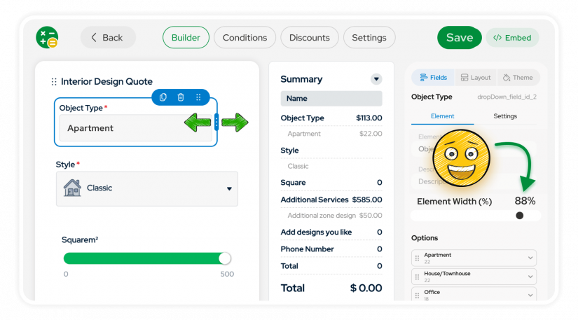
Fields now live on a free canvas. Drop them where they should be, not where the grid allows. Tight layouts, side-by-side toggles, proper compact forms – finally possible. Snap to grid for alignment when you need it. Resize. Stack. Build the density your design actually needs.
Remember 25/50/75/100? Yeah, we don’t either.
Appearance moved into the builder
Before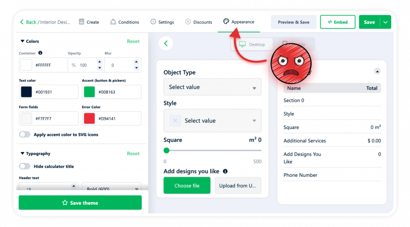
Changed a color? Open Appearance, change, save, come back, check. Wrong shade? Open Appearance again, change, save, come back, oh no, change again. Two related things lived on two different screens, so you were context-switching every time you wanted the design to match the structure.
After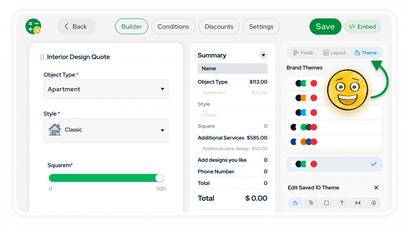
Appearance is now a tab in the builder. Change a color, see it on the canvas immediately. Adjust spacing, fonts, borders – no leaving, no coming back, no “wait, was it #1ABC5C or #1ABC56?”
Conditions works like Figma now
Before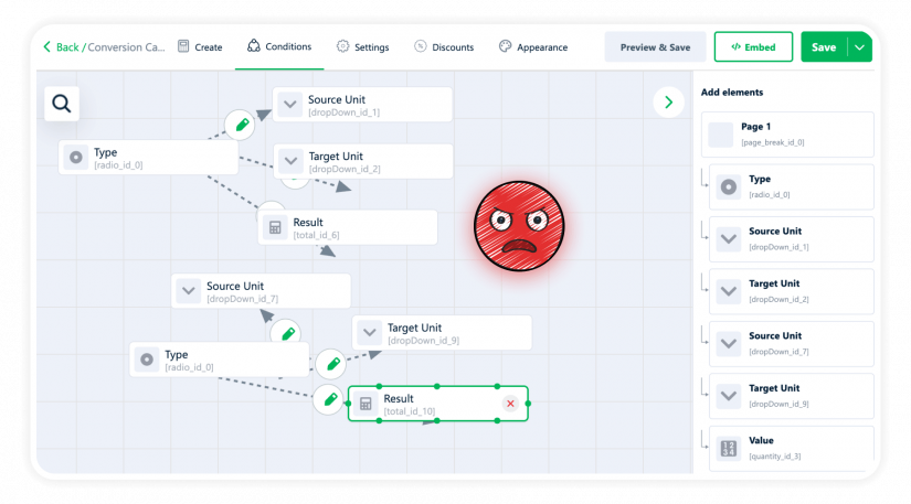
Once you had more than five or six rules, Conditions became unreadable spaghetti. Lines crossing, nodes piling up – you spent more time arranging the diagram than thinking about the logic underneath it.
After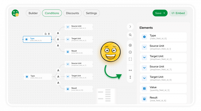
Pan and zoom to navigate big rule sets. Auto-align nodes horizontally or vertically – one click. Drag-and-drop the way you’d expect.
The Christmas lights are gone. (And if you actually liked them – free chaos mode is still there. Auto-align is an option, not a requirement.)
Contact Form and extra flows, in the builder
Before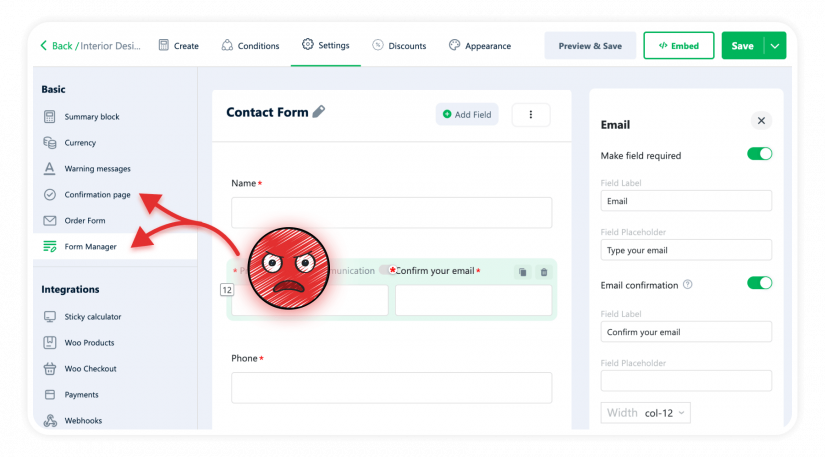
You wanted to add a phone field after purchase? Settings. Change the Confirmation page? Different tab. Configure the order form? Somewhere else again. Three tabs, three mental contexts, and no way to see how any of it fit together until you previewed the live calculator.
After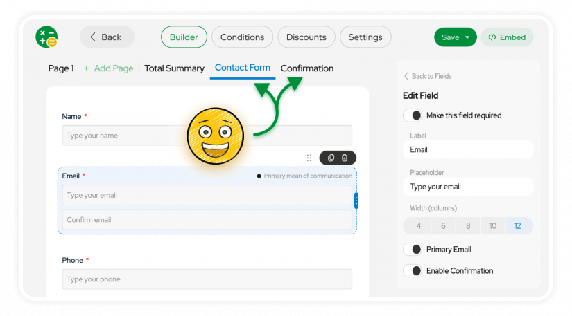
Contact Form, Confirmation, every extra screen the customer sees – they’re all tabs in the builder now, next to Page 1, Page 2, Total Summary. Edit them in context. See how they fit into the journey.
Exactly where you’d expect them – which is where they should’ve been all along.
Under the hood: Vue 3
The reason any of this was possible: we rebuilt the plugin on Vue 3. Vue 2 reached end-of-life, and, more importantly, it was the ceiling we kept hitting every time we tried to fix the things above. Live editing, instant apply, a free canvas – none of it was practical on the old foundation without a rewrite anyway.
So we rewrote it. The builder feels this fast because it actually is. It also unties our hands on the front – new field styles, layouts that aren’t grids of four, calculator structures we couldn’t build before.
If you don’t care about the tech, the short version: 4.0 is the floor, not the ceiling.
How to upgrade from 3.x
How do I install 4.0?
The same way you update any WordPress plugin – through your admin dashboard. Go to Plugins → Installed Plugins, find Cost Calculator Builder (Free) or Cost Calculator Builder PRO in the list and click “Update Now” next to it.
If you have both the Free and PRO versions installed, update both.
Will my existing 3.x calculators keep working?
Yes. All your calculators carry over to 4.0 as they are. Nothing to migrate manually, nothing to rebuild. The new builder opens them and you keep going.
Where do I get help if I need it?
Support is the fastest way: https://support.stylemixthemes.com/. We’re always here to help – drop us a line and we’ll take it from there.
 Important: If you’re running a serious production site with custom CSS, third-party integrations, or anything custom-built around the calculator – test on a staging copy first.
Not a 4.0 thing, just basic WordPress hygiene.
Important: If you’re running a serious production site with custom CSS, third-party integrations, or anything custom-built around the calculator – test on a staging copy first.
Not a 4.0 thing, just basic WordPress hygiene.Upgrading from 3.x? We genuinely want to hear what you think – good, bad, or “how did I live like this.” We read everything.
— The Stylemix Team