Landing pages are created with the intent of making a visitor perform a certain action. These days landing pages are used on websites, social media, and email marketing campaigns. Essentially, landing pages are your way of converting leads into customers.
Even though landing pages seem like a rudimentary method of customer acquisition, year and year again we see that some of the world’s best marketing experts consider these pages as their most powerful method of increasing revenue. [citation]
Landing pages are used for a multitude of sales-related tasks:
- Advertise latest product releases.
- Getting visitors to signup for an email list.
- General growth for leads and sales.
- Collecting specific data through on-page forms.
As a result, even before you begin thinking about design, etc,. you must know what is going to be the primary purpose of your landing page. If there are multiple actions you want a visitor to perform on a single page, it’s more than likely to create confusion which leads to sloppy conversion rates.
What Exactly Is a Landing Page?
Strictly speaking, even this page you are reading right now, is technically a landing page.
That being said, in marketing terms — a landing page is a page on your site that encourages a visitor to take a specific action; on-boarding new leads, email signups, contact forms, and other user-based activities that encourage a specific result.
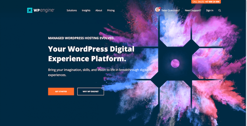
WPEngine is a well-known WordPress hosting brand. Their entire website structure is built around the idea of getting people to sign up for their services.
As shown in the image above, immediately upon landing to the homepage, visitors can choose between seeing different pricing plans, but also have the choice to explore more about WPEngine and why it’s such a good choice.
Generally, new visitors won’t blindly sign up for a service they have no information about.
This is why it’s so important to have a unique landing page the describes your business and/or product in full detail. If you go to the Why WP Engine? page, this is where you start to see more specific design elements that give meaning to the scope of a product that users are signing themselves up for.
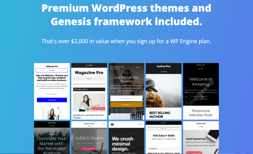
Take this callout for example. WP Engine has partnered up with StudioPress to provide all of its customers with a lifetime supply of premium WordPress themes.
Callouts like this instill immense amounts of selling potential in the eyes of potential customers. The more they get in return for their investment, the more likely that they’ll consider signing up for your service.
Myth: WordPress Provides Limited Design Options
At first glance, WordPress looks like a simple blogging platform that gives writers the means to publish written content. But, this is largely a myth. WordPress has grown a lot over the years, and so has the supply of high-quality themes and exceptional page building plugins.
At the present time, you could visit a beautifully looking website and never realize it was built with WordPress. The capacity at which modern web design elements can be put inside a WordPress theme is nearing the limitless range.
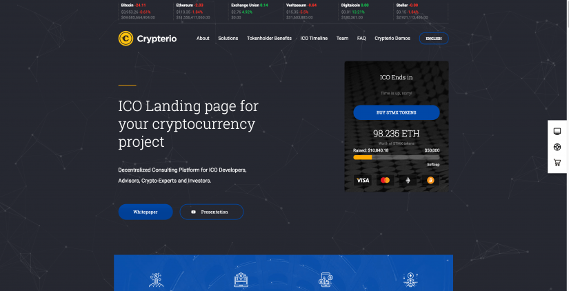
Crypterio is our very own Landing Page Theme for cryptocurrency brands and businesses. It’s one of the best selling themes we have ever created, and the major selling point is, in fact, the theme’s design.
And there are so many demo homepages that we have prepared. Each one using a unique design composition, with the inclusion of thoughtful Call-to-Action elements. And this, of course, is only one of an example of many.
Now that Gutenberg Editor is going live for all WordPress users, we’re surely going to see some major changes in how WordPress bloggers design their landing pages using modern JavaScript technology.
The Essentials for Landing Page Design
Before we get to the tools that you can use for building WordPress landing pages, let’s first understand some essentials.
Although design appearance is always going to look different for each project, there are similarities on the technical side. And these similarities have largely to do with User Interface (UI) and User Experience (UX).
#1: Clearly Defined Goals
Any project you embark on should always have a clearly defined goal. Without a goal, you’re simply creating for the sake of doing so. Whereas goals provide a way to stay on track for each element, image, or word you publish.
For landing pages, the ultimate goal is to convert visitors into customers. In some cases, you might want to collect user email addresses. Something as simple as explaining what your product does can be considered a goal. The question is, how are you going to achieve that goal?
#2: Simple is Better
It can be tempting to use only the most modern design elements, in order to project a sense of professionalism and creativity. But even the most experienced web designers will tell you that simplicity comes above everything else.
Simple websites don’t have extraneous information. This helps navigation in two ways: generally, sites have fewer pages and sections; and the design of the site is usually less cluttered, making it easier to find navigation elements. — Cameron Chapman
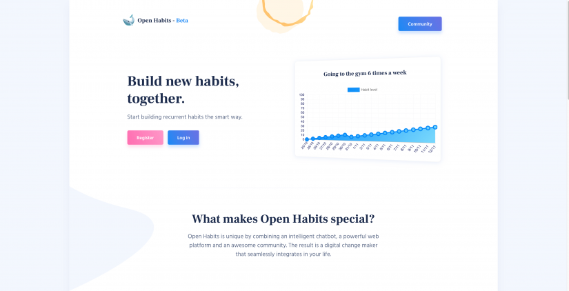
Take a look at the design for Open Habits. The homepage has only 4 clickable CTA buttons, yet the design feels aesthetically pleasing.
What makes this design so great is a combination of fluid colors, simple typography, and concise product description.
Images added to this homepage display what the product looks like on the inside, whilst typography is used to describe the product in as few words as possible.
You can use a site like Landub to explore different variations of landing pages across many of the world’s most successful brands.
#3: Projecting Trust
Trust in web design is purely an art of psychology. Would you rather trust someone who can showcase their experience, or simply take someone’s word for it? Generally, the former is something that people naturally lean towards.

These days, you can project trust using multiple elements. First, and one of the most used elements, is to display the logos of who your brand is working with. New visitors might recognize a brand and immediately feel more comfortable with the level of services that you provide.
Second, another highly popular choice, you can use testimonials. An honest testimonial can highlight a particular issue that an existing customer was able to solve with your product. As a result, potential customers can get a feel for what you have to offer.

And lastly, video content. Video marketing is a highly untapped field, but if you can provide detailed video presentations for what your product does, it’s almost as if the visitors are existing customers already.
A video gives an unparalleled overview of products and services and is extremely potent for projecting trust.
#4: Mobile-First
The usage of mobile devices has already surpassed that of desktop computers, and this growth is only going to continue to increase. While most modern themes tend to have a fully responsive base, it’s still crucial to check your designs for complete mobile compatibility. Sites like mobiReady come extra handy in situations where you want to check mobile responsiveness across a vast array of devices.
#5: Bold Statements
You probably won’t be changing the World any time soon, but that shouldn’t stop you from making bold statements on your landing pages.
Do you believe that you are the best at what you do? Does your product surpass the capability of even the most notorious competitors? Make it known to your audience!

Bold statements arouse curiosity, and curiosity means that visitors are going to be much more inclined to learn more about your business.
#6: Less is More
Landing pages don’t need a lot of text to get the job done. The less text you can use to explain a specific feature, the more likely that a visitor is going to retain their attention span.
You can implement techniques like ‘feature lists’ or ‘visual preview’ to help ease the process of explaining your product and/or service.
Otherwise, you’re just writing a big blog post on your homepage and it doesn’t feel authentic.
How to Create a Landing Page with WordPress
Unless you are a theme developer, you won’t be able to do much with the default WordPress installation alone. So, you have to seek out alternatives. Luckily, the WordPress ecosystem has grown so much that there are more tools for designing a custom site than one would be able to use. And that includes themes that act as website builders specifically.
For the purpose of creating a landing page with WordPress — we are going to narrow this process down to two parts: themes and plugins. While we cannot talk about every theme and plugin on the market, what we can do is spotlight the most prominent solutions.
Avada: Best Selling WordPress Premium Theme
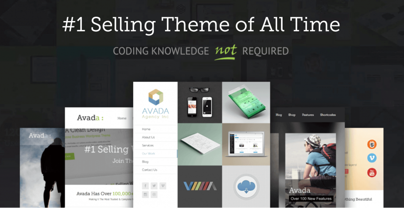
With more than 470,00 sales to date; Avada is the bestselling WordPress theme on the market. Built as a WordPress theme, Avada performs more like a page builder given its vast scope of options and settings.
There are dozens of pre-made templates for a variety of business purposes. For example, Travel, Lifestyle, Applications, Landing Page, Hotels, SEO, Charity, Agency, and so on. Whatever your business type, there’s a high chance that Avada has a starter demo for you to use.
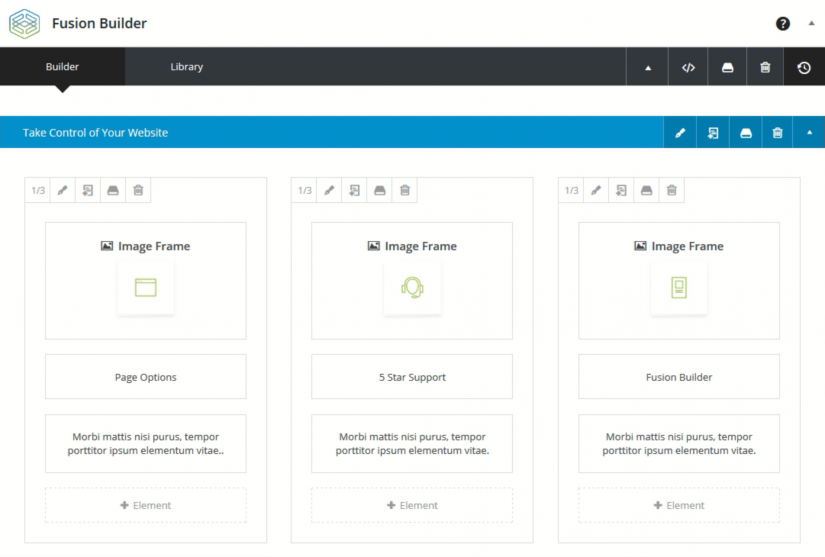
What makes Avada so special is its own page building interface, called Fusion Builder. This Builder is responsible for the design of all those amazing demo previews. Further, it’s arguably the reason why hundreds of thousands of WordPress users have chosen specifically Avada as their main theme.
The Fusion Builder Library allows you to choose any Avada demo and all the pages it contains. This is perfect for mixing different demos if, for example, you like the about us page from one demo but contact page from another demo. Every single page imported gives you the page layout, fusion page options and page template along with image placeholders.
Fusion Builder provides a seamless Drag & Drop functionality for building websites and landing pages. You don’t need to know anything about coding or development, all you need is some free time, a good cup of coffee, and some creative juice to get you going. A theme like Avada is the perfect solution for implementing many of the landing page design tips we’ve discussed in this post.
Elementor: Free WordPress Page Builder

Modern times demand modern features. And this is the vision upon which Elementor strives. Elementor is a real-time page building plugin that you can use to edit your website directly from the homepage. All changes you make appear to the live site instantly. But, it’s not just about being up to speed with the latest tech.
The Elementor Page Builder provides modern design elements and widgets that are oftentimes better than what you can find in premium designs. In other words, Elementor is a high-level plugin with a team of WordPress professionals working hard to make this the best page builder ever!
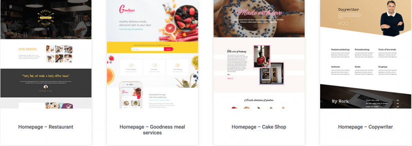
You can visit the Elementor Template Library to see 100’s of pre-built designs. All of them can be activated directly from Elementor’s dashboard.
A lot of elements in this plugin are based on Widgets. You can use Widgets to achieve a specific result. For example, add a widget for displaying a button. You can then style that button with a custom design. Further, there are widgets for adding icons, testimonials, headers, videos, toggle tabs, galleries, and much more.
And should you enjoy the free version of Elementor, you can always consider getting the Pro! In Pro, you get additional 50+ Pro Widgets, more than 300+ Pro Themes, and a custom Theme Builder. Themes built with Theme Builder can either be sold or used for client work. The free version is not limited in case you are wondering. Pro simply adds more custom tools and design possibilities.
In Conclusion: Modern Web Design with WordPress
The days of WordPress being merely a writing platform are long gone. You now have the ability to use WordPress both as a publishing and business solution. And there are good reasons to do so, first of which is the financial aspect. Managing a site running WordPress is fairly inexpensive, and themes/plugins never go above the price range of $100.
On top of being affordable, you have the support of an immense worldwide community. Stuck with a problem? A simple Google search is likely to provide multiple alternatives for solving that problem. Found an interesting feature that a different website has? Chances are, you can get that feature implemented in WordPress. So, as you can tell, there’s a lot of dynamic flexibility that comes into play should you need it.
While our post focuses strictly on landing page design, it wouldn’t hurt to study other topics on modern design principles. At the end of the day, if you can achieve a certain result yourself, you’re saving a great deal of monetary investment. Keep an eye out on this like web design case studies — these are often packed with concise details on how design affects user behavior.
Hopefully, this post has shed some light on how WordPress can be used to design websites and pages. Drop us a comment if you have additional feedback or wish to raise a concern!


