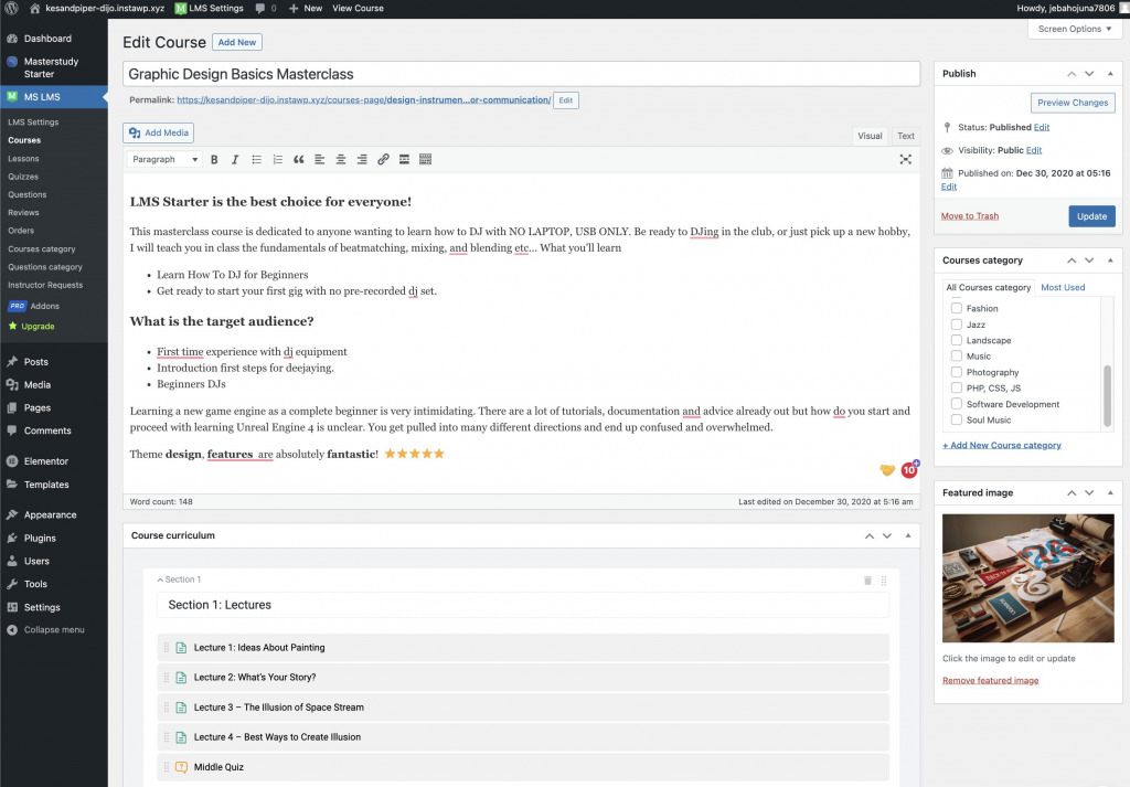
Take a sneak peek of MasterStudy LMS 3.0 before it’s released, featuring a completely overhauled Course Builder that will make it easier and faster for educators to publish courses.
This was always our goal when we first started developing MasterStudy. We recognized that educators are too busy creating learning material and promoting their courses, and shouldn’t have to learn code to run their businesses. Or have a poorly designed UI slow them down.
Internally, we obsess over ‘time-to-course-drop’ – the amount of time it takes for someone to publish a course from scratch. It’s an important metric that our devs look at closely. They even race each other during testing – beers have been won and lost as part of this QA task!
The first version of our MasterStudy LMS did a good job. It wasn’t perfect, by all means, but our users liked it. We’re proud that our plugin has helped thousands succeed in their endeavors.
Content Outline
- Starting by… never stopping to learn
- Why we decided to re-develop the Course Builder
- Introducing the new standard for WordPress LMS Course Creation
- Will it deserve an A+?
- When will MasterStudy LMS 3.0 be available?
- Are you new to MasterStudy LMS?
Starting by… never stopping to learn
This is what you tell your students, right?
The same philosophy drives innovation across our product portfolio at StylemixThemes. We spend time a lot of time talking to users of our products and analyzing user feedback. For example, in a recent Customer Experience Survey participants highlighted it as MasterStudy’s best feature.
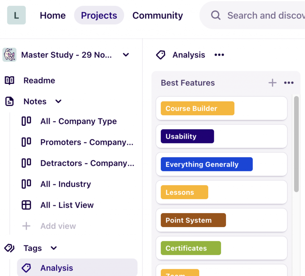
A tip: don’t look at numbers alone but invest time in qualitative research as part of your product development. Apps like Dovetail make it easy and quick.
Here are some of the things we have learned about the MasterStudy LMS and the Course Builder over time:
- MasterStudy LMS counts over 10,000 activations
- The top 3 use cases are: online schools, online coaching, and Elearning marketplaces
- Educators publish an average of 8 courses per installation
- The most used features (excluding the Course Builder) are the Custom Certificate Builder, Email Manager, and Drip Content tool
- The most important features for educators are Course Builder, Monetization and Payment options, and integration with popular WordPress plugins
These are just some of the data points we consider when we brainstorm product development. We also need to keep an eye out for what’s new in the market, broader trends in Elearning tech, and what’s happening in the WordPress ecosystem.
Take the Classic editor, which is still widely used. Its days are numbered as Gutenberg has matured and become ‘production ready’. Page builders are getting better too, and there are more to choose from. There have never been as many options to quickly get started with WordPress, whether you’re a developer, creator, or educator.
These developments give us the confidence we need to be innovative as we want to be as we explore and experiment with UX paradigms.
Why we decided to re-develop the Course Builder
Re-building a core function is no easy feat and represents a significant investment in time and resources. But it was easy to justify – here are the three main reasons:
- Innovation is part of our DNA. We set ourselves a high standard and work hard to achieve it.
- To consolidate our free and Pro versions
- To offer the best WordPress LMS Course Builder
If you think this sounds too much like what a Marketer would say… you’re right. But it’s also true: we attribute our success to our laser focus on quality. By setting our goals high we always end up delivering a great product, and that drives sales.
Introducing the new standard for WordPress LMS Course Creation
Let’s unpack #3 above so that you can appreciate the work behind the tagline, starting with what users want to achieve.
Improving usability
An LMS is a complicated piece of functionality. Even Course Builders alone are hard to navigate considering the structure and types of learning assets they are designed to deliver. Despite this, educators want to get going quickly and publish their courses as painlessly as possible.
Our objective: to make editing, tools, and navigation more intuitive and reduce the number of clicks users need to create or edit a course.
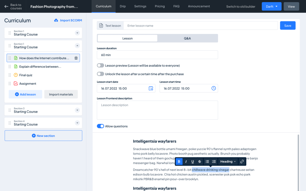
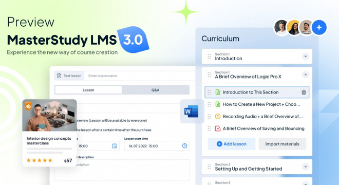
The new 2-column approach greatly improves usability. The course structure is defined and managed on the left and the learning content is handled on the right pane. We’ve removed pop-ups and links that opened other pages.
Presenting a new, cleaner UI
Interfaces need to strike a balance between elegance, usability, and branding. The UI should help and never hinder the course-building process.
Our objective: is to make it as clear as possible to the user what the context is, what tools are available for the immediate task, and what the next steps are.
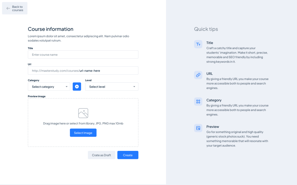
The started screen of the new UI acts like a page builder by taking over screen real estate in full for a more focused editing experience.
We’re redesigned the UI to look cleaner and less cluttered, placing elements where the user expects them to be.
A consistent product experience
The experience should feel familiar the moment someone tries to build a course for the first time and quickly become second nature. Upgrading or downgrading should not affect this negatively.
Our objective: to offer the same great experience to both free and Pro users.
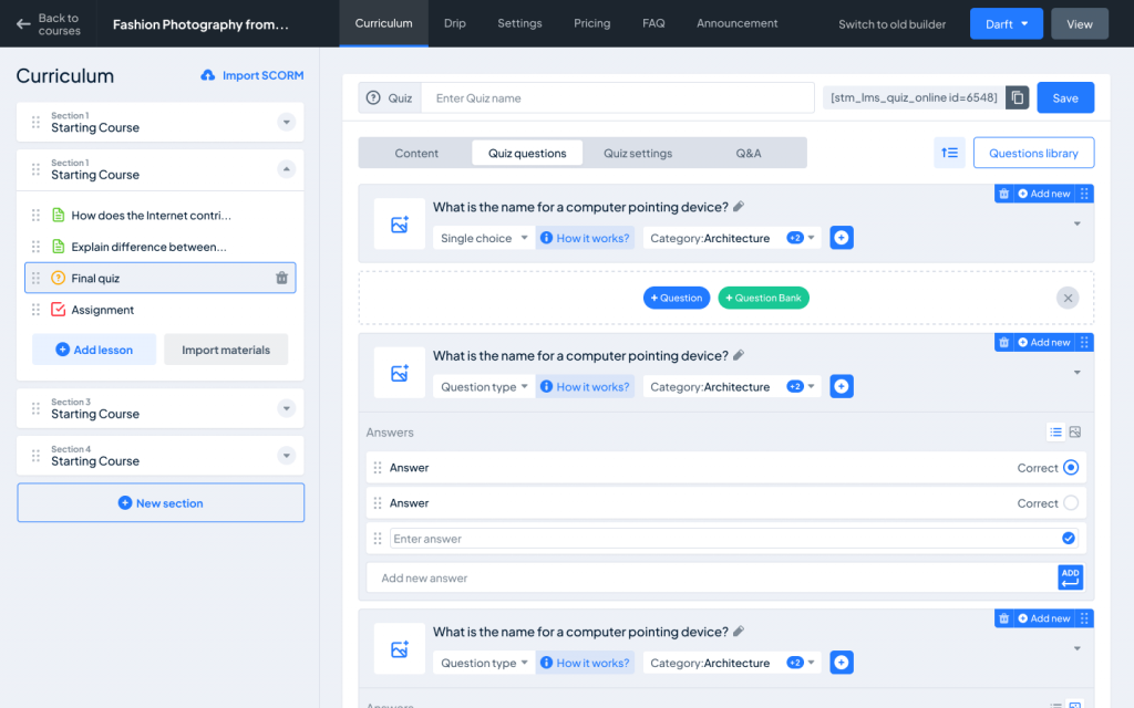
There is now only one Course Builder for all types of users. Free users don’t have to learn how to navigate a new interface when they upgrade.
Faster code = faster course building
A workflow shouldn’t be slowed down by a sluggish interface. The first iteration of MasterStudy LMS was never particularly slow, but there is always room for improvement (as we learned from user feedback).
Our objective: to optimize code and improve page load speed.
During QA, our team was able to smash the time-to-course-drop record set with the last version of MasterStudy LMS.
Will it deserve an A+?
We hope to get a B+, at least. We did work hard the last year.
Usage metrics will help us understand where we can improve further, and we’ll gather good feedback via our yearly Customer Experience survey.
The most important measure, however, is to what degree changes will help you be more successful. Will your workflow improve? Will be building courses faster? Will the re-organized UI be clearer to understand and require less thinking on your part?
Let us know where we can improve further.
When will MasterStudy LMS 3.0 be available?
Soon! The dev team is ironing out the final batch of bugs before it is ready for release.
Sign up for our newsletters to be alerted once MasterStudy LMS 3.0 is released or keep an eye out in our Facebook Group.
Are you new to MasterStudy LMS?
Head over to our homepage to learn why it’s the best WordPress LMS plugin to create and sell online courses.
The new version is not available yet, but you can try the current version and get a sense of what it can do. Upgrading will be very easy.
You can download it for free to try our online demos as a Student, Instructor or quickly spin up a Back End Demo.




Hi,
everything is great but i want your team to kindly focus on students experience as its the only thing that matters eod. educators exp doesnt matter we will upload course somehow ( and now that ui is easy on masterstudylms so its fine ) but students exp is more important .
Please build dashboard that looks clean and elegant like Udemy grade and course taking experience i mean players/ next chapter nav etc if it was like udemy or skillshare type ui it would be awesome for students and students experience is what matters. i am sure this is what all educators also believe.
Thanks again for amazing plugin 🙂
Hi Rakesh,
Thank you for your comment and such a nice suggestion.
You are right. We will keep going with improving our plugin not only for the instructors but for the students as well.
I would really suggest you leave this proposal to our feature request panel, so our developers can track them to develop and include in the next updates – https://stylemixthemes.cnflx.io/boards/masterstudy-lms
We hope you will like our new Course Builder in the next update, which will happen very soon : )
Well put Rakesh, specially the mobile student experience. Too many lazy coding leads to terrible results. Every tried quizes> matching > item match (for language learning) = match the meanings; if your ‘meanings’ are too long, then I just doesn’t function! Not to mention many other mobile UI issues
I would agree with the Rakesh comment, we need more of student user experience. Simple yet intuitive (some of my students can’t even navigate to user setting since it was not present in user dropdown, so I have to add SETTING on the user menu). I would also suggest you revamp the dashboard.
Some of the teachers, educators and devs have already experience in WP and it is simple adding course like just adding products in Woo. For me as a dev, I am not even using frontend adding the course. I used to have it in backend. Appreciate the update, keep moving forward! All the best
Hello, I have a purchased MasterSrudy theme.
I’m making my own marketplace. Will the new version of the LMS create private courses so that they are not visible on the site? And only the teacher could give access to them.
Hi Stylemix team…
I am testing the new version and I am really appreciating it. Congratulations to the whole team.
Cause of this attitude of yours to be always improving MS-LMS, I have no doughbt that your product is far the best one in the market.
I am glad to be your client!!!
Just a encouragement: in this new version or maybe in the future one, try to add a ‘tooltip feature’ for additional information on key words in the texts. This simplifys the course deepeness and and also the student side.
Hi Jotta,
Thank you for your comment!
We are glad that you liked our recent big updates and beta.
The tooltip suggestions look like an interesting idea. Could you add this to MasterStudy Feature Request Form? – https://stylemixthemes.cnflx.io/boards/masterstudy-lms
Our developers add new stuff to MasterStudy mainly based on the requests in our board.
It would be of great help if MasterStudy allowed the creation of classes for each course, along with seamless integration with the CartFlows plugin. This combination would significantly enhance the user experience during the product sales process, making it more efficient and enjoyable.
Hi LabCriar,
Thank you for your comment.
These are the good proposals! We need to evaluate this first.
Meanwhile it makes sense to propose your wishes and suggestions to our Feature List – https://stylemixthemes.cnflx.io/boards/masterstudy-lms
This will guarantee that the offers will be checked by our developers.
Hello, when i try to add a new course, it keeps loading the page and then shows me an error “Something went wrong”.
Any idea how i can overcome this issue ?
Hi Noman,
Thank you for your comment.
Would be good if you check the system requirements for MasterStudy and make sure they match yours – https://docs.stylemixthemes.com/masterstudy-lms/getting-started-1/system-requirements