Think about someone visiting your website. Maybe they check out your home page, look at a landing page, or browse some of your product pages.
They get more and more interested in everything they see. They decide to do something—they download a file, sign up for your newsletter, or even buy something.
Since they’ve taken action, you know they really like what they see. They might even want to stay on your website a bit longer to learn more. Whether they do or not can depend on one thing you can control: your thank you page.
Keep reading to find out how to make a custom thank you page.
Two reasons why you may need a thank you page
A thank you page’s main job is to thank the user for doing what you wanted them to do.
Imagine you asked someone to download your free checklist. Your thank you page would show up after they click the download link. This is your chance to say thanks and explain what happens next. For example, you could tell them to check their email for the download link.
You could just send the checklist to their email without saying thank you or telling them where to find it, but that’s not great customer service. Without a thank you page, visitors might not know if their download worked. A thank you page helps reassure visitors that what they did on your website was successful.
Another important point: some people who see your thank you page might be very interested in your business. Many companies add calls to action (CTAs) on their thank you pages and get conversion rates over 20%. So, don’t miss this chance to grow your business.
Questions you need to ask yourself to make a really good thank you page
A thank you page is like a follow-up email you get after making an order, just in a way your favorite bookstore sends you a cute postcard with a puppy with your books. It gives your visitors a clear idea of what to do next. The best thank you pages are engaging and inspiring and encourage the visitor to take another action. They make visitors feel good and want to learn more about your brand.
So, how should you approach creating your thank you page?
- Do you keep the conversation going?
- Do you smoothly transition to a new topic?
- Do you offer them something else they might like?
Avoid boring thank you messages like:
- “Your order is being processed. Thank you.”
- “You are now subscribed.”
- “Thank you for your purchase. Write to an email [email protected] if you have any questions about your order.”
Instead, try to keep the excitement going. Your thank you page shouldn’t be the end of the conversation; it should be the beginning of something new. Providing a good user experience is important.
Thank you pages are useful for all types of businesses. You can use them for any user action, like downloads, registrations, quote requests, signups, contact forms, and more.
Thank you pages add a lot of value to your business and take very little time to create. They can even help increase sales through cross-selling, upselling, referrals, and promoting discounts!
And remember, you’re not limited to just these ideas. Feel free to try different things on your thank you pages until you find what works best for you.
Being gracious pays off in both personal life and business. Saying thank you leaves customers with a positive impression of your brand. So don’t hesitate to say thank you!
How to Make a Custom Thank You Page for Orders
Let’s say you run a yoga studio. You have this calculator on your website and use the Cost Calculator plugin to let clients book classes and purchase memberships.
Turn on the Stripe or Paypal payment method in your calculator settings. Go to the Settings tab>>> Confirmation page and select Separate page to create a dedicated thank you page for your clients.
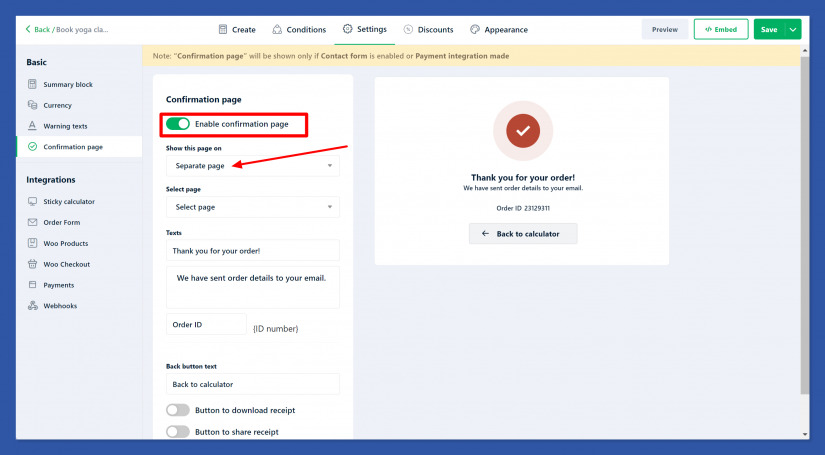
Choose a Separate page on Show this page setting. Add a thank you message: “Thank you for booking a class with us! Change the text before the ID number to “Your Booking ID:”.
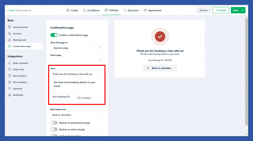
Set the text to “Book Another Class” for the back button text. Enable the option Button to download receipt and set the button text to “Download Your Receipt”. Allow users to share their receipts. Set the button text to “Share Your Booking”. Add a button with the text “Refer a Friend” and link it to a referral program page on your website.
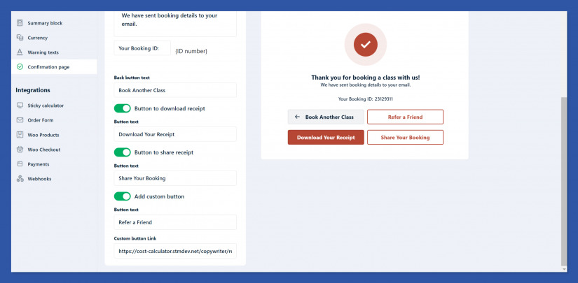
You can change the look of the page by customizing the look of your calculator in the Appearance tab to match your yoga studio’s branding.
By following these steps, the yoga studio creates an engaging thank you page with Cost Calculator that not only confirms the booking but also encourages further interaction, such as referring friends to the studio.
Thank you pages are powerful tools that work for all types of businesses. They can be used for various actions like downloads, registrations, quote requests, signups, and contact forms. The possibilities are endless.
Adding a thank you page brings significant value to your business with minimal effort. These pages can enhance sales through cross-selling, upselling, referrals, and promoting discounts. With the Cost Calculator plugin’s Confirmation Page feature, you can easily create and customize thank you pages that suit your specific needs.
You can experiment with your thank you pages until you find a formula that works best for you. Being gracious in your thank you pages not only shows appreciation but also leaves a lasting positive impression on your customers. So, don’t hesitate to say thank you and make your customers feel valued!
