
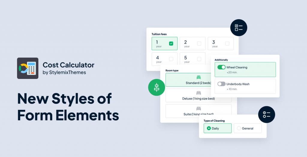
We are thrilled to announce the latest update for the Cost Calculator plugin, version 3.1.7, which includes new styles for certain form elements. With these new styles, it is easier than ever to customize the appearance of your forms and make them more visually appealing. In this blog post, we will explore the new styles and how they can be used to enhance the user experience of your Cost Calculator forms.
Content Outline
- How to Change Styles in the Form
- Styles for Checkboxes
- Styles for Radio Buttons
- Styles for Toggle Buttons
- Conclusion
How to Change Styles in the Form
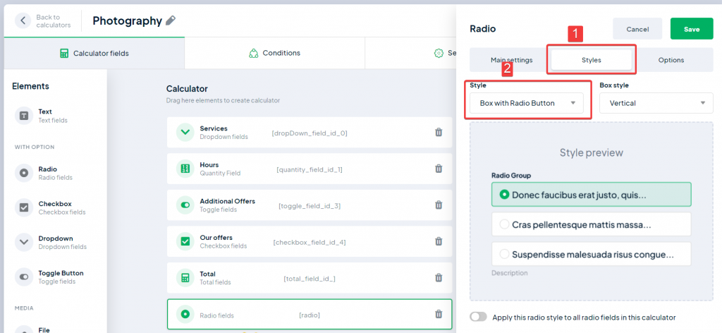
We have to say, the new styles for certain elements in the Cost Calculator update are easily accessible. It’s actually pretty straightforward. All you need to do is open any created form, drag an element (such as Checkbox) onto the canvas, click on it, and you will notice a new Styles tab (which was not available before).

It is important to note that the new styles are currently only available for five elements: Checkbox, Image Checkbox, Radio Buttons, Image Radio, and Toggle Button, and only in the Pro version of plugin.
By simply clicking on the Styles tab, you can easily change the appearance of these elements to fit your preferences and improve the overall design of your forms. The styles work both for horizontal and vertical layouts of form.
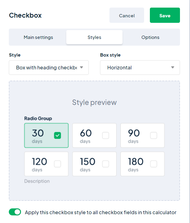
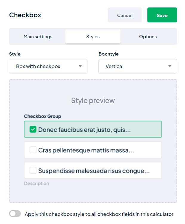
Styles for Checkboxes
Let’s try a new style for the Checkbox element. Checkbox has 5 following styles:
- Default;
- Boxed;
- Boxed with Checkbox (literally checkbox inside the stylish box);
- Boxed with Checkbox and Description;
- Boxed with Checkbox, Description, and Heading.
That’s quite simple. You select the appropriate style from the list above, and in the Box Style field, you determine the layout. The layout can be horizontal or vertical.
For example, this is the horizontal layout for Boxed with Checkbox, Description, and Heading style:

And this is the same style, but vertically applied:

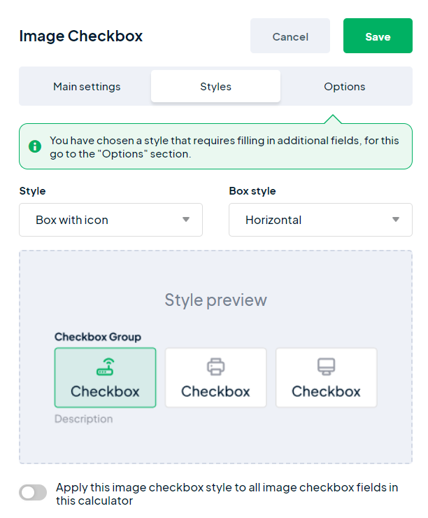
Additionally, the new styles are applicable to a similar element – Image Checkbox. This element has two styles:
- Default;
- Box with Icon

Finally, there is one small switcher, which will apply the changes to all identical elements in the form.
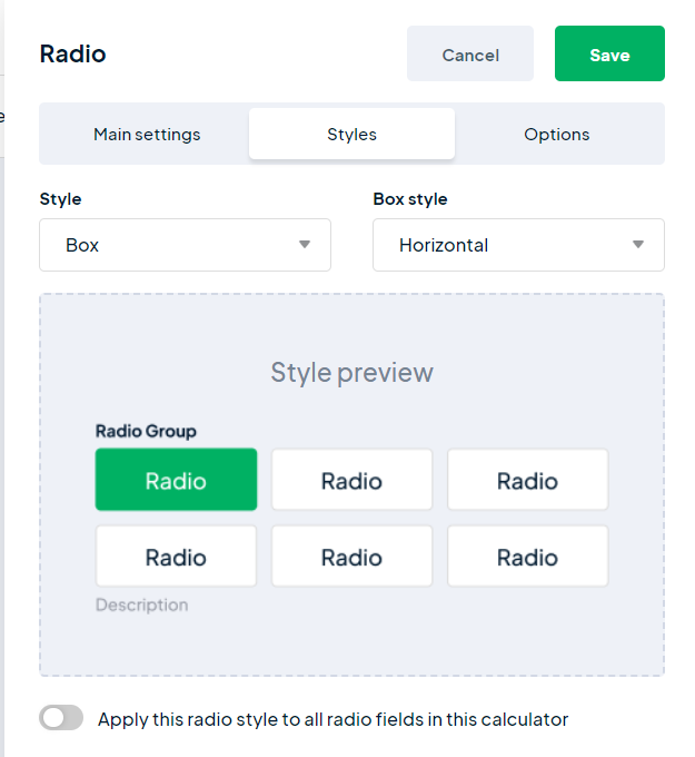
Styles for Radio Button
We have added the styles for Radio Buttons too. Currently, there are 3 styles for this element:
- Default;
- Boxed;
- Boxed with Radio
Like Checkboxes, it will give you rich options to display your calculator or form with the options format.

The same styles (alongside Image Checkbox) came to the Image Radio.
- Default;
- Box with Icon
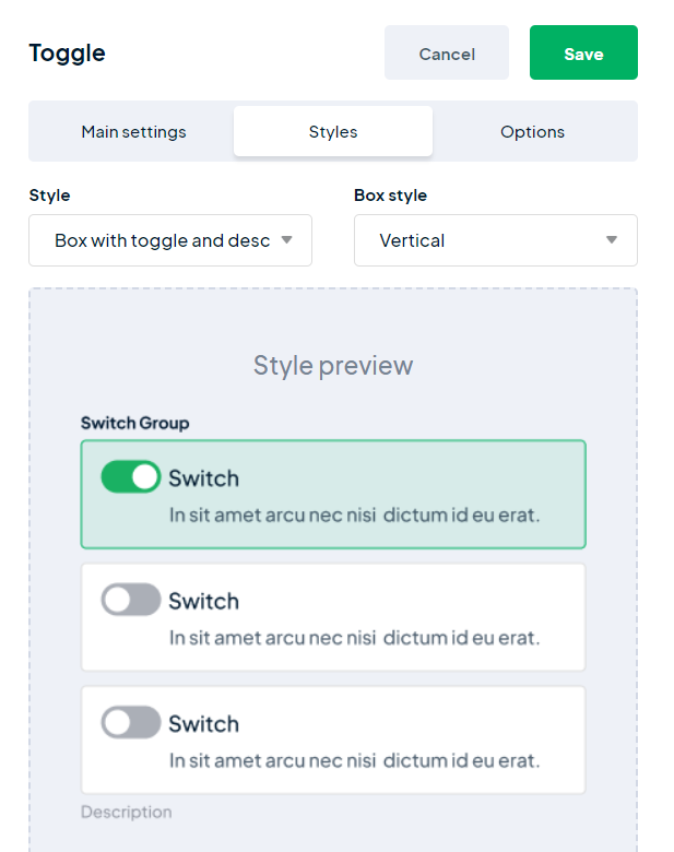
Styles for Toggle Buttons
Finally, a new style has been added for Toggle Buttons (in addition to the default style) in Cost Calculator, which will make your form more versatile.

Conclusion
That’s all for the recent update of the Cost Calculator.
We hope that you, Cost Calculator users, have enjoyed the latest update with new styles for form elements. If you have any questions or suggestions, please feel free to ask in the comments. We will continue to add more styles and customization options for form fields in the future. Stay tuned for more updates. See ya!