
Slider Revolution is literally one of the most popular WordPress plugins today. With over 400 thousand sales and an average rating of 4.75 the plugin has proven its effectiveness and greatness.
Revolution Slider: What makes the plugin so great
Slider Revolution was developed by Themepunch. This plugin is a builder for creating rich, dynamic content for web pages. The emphasis is on “dynamic”, as it allows you to build thrilling slides adding motion to the pages.
The plugin is supplied with an easy-to-use builder and tons of options. Well worked out packs of settings let the user adjust every single detail of the slider and allows working with absolutely different types of content. Sliders can be created for separate posts, for the whole pages and their small parts. To be more precise with the plugin you can create:
- image sliders and carousels
- featured posts sliders
- social media feeds
- media galleries
- hero blocks and front pages
Reasons you should use Slider Revolution with your website
You can’t go wrong with Slider Revolution. A comprehensive plugin with user-friendly tools is a perfect solution for creating beautiful sliders, and here are the reasons why.
Bundled Plugin
Today almost every WordPress theme comes with a Slider Revolution plugin. Usually, the theme package includes the free version of the plugin. The bundled plugin is limited to very basic features, but still, it is very convenient to get the theme along with the slider builder.
However, if you would like to access a lot of the plugin’s features you have an option of purchasing the independent plugin. The regular license will cost you $29 and you can get it in the Codecanyon marketplace.
For the extended license, you will have to pay around $150, and get a year of technical support just for 9$.
Yes, the plugin can cost you some money, but you can still create great sliders even with the regular license of the plugin.
Templates
The amazing plugin will not only impress you with the tools and features, but it also has a collection of good-looking premade layouts. A wonderful collection of pre-made templates and the library of free media objects that you can use on your slide will simplify and speed up the slide creation. You can select the template for any projects of yours and instead of building a slider from scratch you can save yourself the time and go ahead with the pre-built layout.
Simply import the template you chose and begin creating right away.
Besides this, you’ll get access to the big free library of different objects such as font icons, background images, transparent PNG objects, SVG, and others. You can use them and easily insert them into your slides.
Visual editor
Slider Revolution is supplied with an amazing WYSIWYG editor that makes it very simple to create and modify slider templates. Many website owners find it difficult to write complex codes or hire a separate team for that task. Thanks to the slider editor you can save your time and enjoy the drag and drop feature to build outstanding slides.
The slider plugin allows you to be more creative with the sliders you build and present them easily on your website. You will have tons of custom options like building custom slider location, choosing slider delay, adding transitions, adding media layers, and so on. this can be done in no time using the drop-down list. Moreover, the plugin has many navigation features that allow you to change the style of navigation and add arrows, bullets, tabs, and thumbnails.
High-Speed performance
Slider Revolution is well coded to load fast. All aspects of the sliders are optimized, and it uses advanced debugging options to address any issues, loads core files automatically, and scales with features used. It also employs intelligent lazy loading and is SEO optimized.
Responsive Layouts
One of the biggest problems that many web developers experience is that sliders lack responsiveness. As a result, those sliders do not work well on small devices or are not displayed at all. Responsiveness is an essential component of user experience. With the huge amount of traffic coming from mobiles, it will be a shame for your sliders to not perform well on other devices.
Slider Revolution is not just a simple slider. The plugin is responsive ready, so whatever slides you create, you can be sure that they will be optimized for whatever device they will be used on.
Slider Revolution has made sure to set the responsive breakpoints for each slider, making any design look great on different devices and small screens. Whatever option you choose — single, carousel or standard slider, you can be sure it looks just perfect on any device.
Customizing Options
Another advantage of the Slider Revolution plugin is its diverse customizing options. You can set slide delays, choose navigation arrows, parallax backgrounds, add media layers, insert buttons, set custom fonts, add margins, and many others.
Slider Revolution plugin allows you to customize anything. In order to save time, you can save presets to use them later in the slide transitions, font styles, and layer animations.
Slider Revolution Addons
Want to make your sliders more complex and diverse it with transition effects, animations?
You are good to go! Slider supports different content types, like blog posts and current posts, it allows you to use feeds from social platforms like Twitter, Facebook, Vimeo, YouTube, and Instagram. You can add links, videos, images, and text in no time. With the help of the Variations feature, you can build a feature-rich and information-studded slide that visitors can use.
Security
Security is one of the most significant aspects when it comes to websites. You might hear that there war vulnerability affected by Slider Revolution some years ago. From that time Themepunch has increased the protection of the software and is now using a third-party organization to audit the plugin issues regularly. So you can be sure that the plugin is highly secure.
Technical Support
The plugin comes with the detailed documentation and big FAQ section with the most popular questions about the plugin. That is why it is very easy to get started with the slider revolution even if you have no experience working with it. Availability of the detailed tutorials make it simple to create the slide for the website for everyone.
Content Sources
Plugin successfully handles the creation of sliders for various content sources. Whether it is a WooCommerce product or a common post, Slider Revolution has the tools.
Powerful features make this plugin a number 1 choice for everyone. Its primary advantage is that it presents the category of an all-in-one solution. You do not need any extra plugins, everything is inside the plugin.
We also should mention that it is affordable. The regular license will cost you $26. Considering the number of features you get for the price, the Slider Revolution is the most affordable slider plugin in the industry.
In this ultimate guide, we will cover everything from the installation of the plugin to adding a new slide and placing it on the website.
Installation of the plugin and primary setup
Many of the theme developers include Slider Revolution in the package of the themes.
If you have purchased one of the premium WordPress Themes from StylemixThemes you don’t have to install the plugin manually. Slider Revolution will be installed automatically with the demo import.
If the package of the theme you are using does not include the plugin, you need to download and install it manually. To get a copy of Slider Revolution follow this link.
You will need to buy the plugin. Log into your Envato account and place your purchase. After that download the file — select the download option for “Installable WordPress file only.”
Now you need to add a new plugin to your site. Go to your dashboard — Plugins > Add New. Once the installation is finished, activate the plugin.
Congratulations, you are all set and you can start creating your first slider!
How to update Slider Revolution
Themepunch releases regular updates of the slider plugin. To update it open Slider Revolution from your dashboard and follow the Updates tab. On this page you can find a small section with the title “Plugin Updates”. It is specified here what version of the plugin is currently installed on your website and an available version for update.
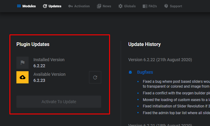

Also, you can use the standard way and go to Dashboard > Updates and install the new version of the plugin from there.
Slider Revolution: Getting started
If you are using the slider for the first time, it might not be clear enough with all the terminology used in there. There are three major elements that you can be confused with. They are modules, slides and layers. Each of them can be part of another as well as work individually.
For instance, you can create a module designed to act as a slider and it will contain slides. Besides this, you can make modules such as navigation menus or headers, which are not sliders at all, but they will still contain slides. The reason for that is Slider Revolution was initially created as a slider builder, however, now it is also used as a complete website editor. So with the help of it, you are able to build much more than simple slides.
Relationship Between Modules, Slides & Layers
Modules are containers for Slides which are containers for Layers.
Modules exist to contain slides. Every module must have at least one slide. When you create a blank module an empty slide is added automatically. You can create additional slides, or add everything just to a single slide. It fully depends on the type of content you are creating.
The Slide is a container for layers. Every slide must have at least one layer. When a new slide is created a background layer is added automatically. This layer is always there, it can be renamed and made invisible, but it cannot be removed. This background area can be filled with layers.
Layers contain visual, audio, or layout items and are added to slides. Text, button, image, audio, video, group, and row are all types of layers. Each layer represents a single piece of media. Layers can be animated in a way that performs your idea the best.
How to use Slider Revolution: Global settings
As we already mentioned, Slider Revolution has tons of options, and this is not an exaggeration. That is why, before starting to build the slider we recommend you look through the global settings first and learn the main principles of working with the plugin.
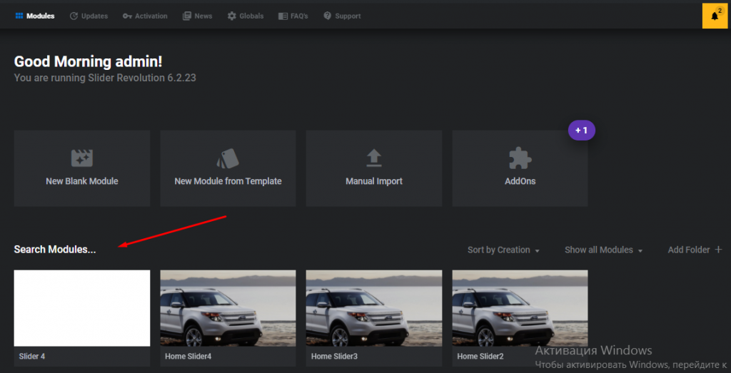
If you click on the Slider Revolution from your dashboard you will be able to open the setup screen of the plugin.
Setup screen
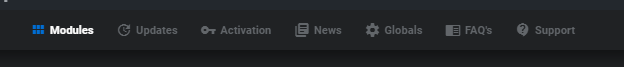
On the top of the screen you can find the tab with the following options:

Modules, Updates, Activation, News, Globals, FAQs, Support.
On this stage, we will be working only with the two of them: Modules — to create a new one, and Globals — to look at the global plugin settings.

Global Settings
We will start with the Globals. The global settings are mainly divided into several sections of:
- General
- Default Layout Grid Breakpoints
- Fonts
- Miscellaneous
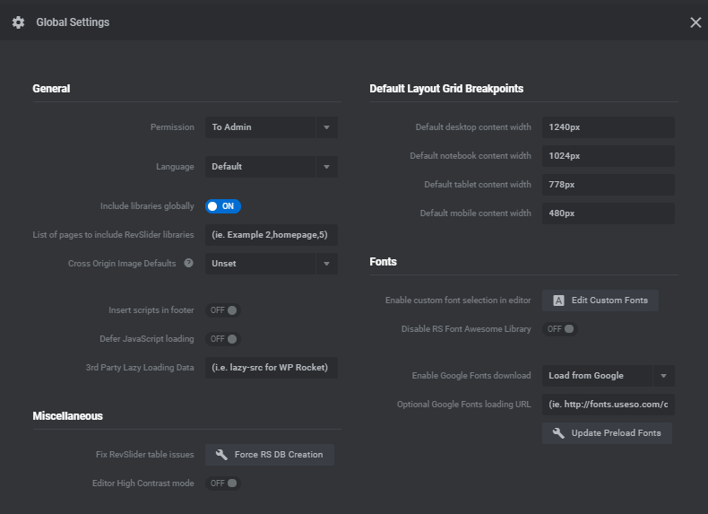

These settings are responsible for default responsive grid options that apply when building a new slider, custom font loading, database creation, and more.
There are only several options you will need to focus on. First, is the responsiveness, to make sure your future sliders look good on any devices. Here is a quick guide about devices and their sizes.
In the Default layout grid breakpoint section, you can set the width in pixels for different types of devices: desktop, notebook, tablet, and mobile.
As long as every device has its own size, enter the exact width for each type to ensure the correct display of a slider.
- Standard Desktop monitors have a width of 1920px.
- Notebook devices, which include all laptops, MacBooks, and horizontally oriented tablets are about 1600px width.
- Vertically oriented tablets have a width of not above 778px (based on the iPad).
- And mobile devices. This is an important part, as nowadays more than half of all internet traffic is generated through mobile devices and it won’t be satisfying if users can’t see the sliders on your website properly. However, this can be confusing, and the reason for that is that modern smartphones have absolutely different sizes. We suggest you use the number, not above 500px.
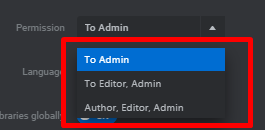
The second thing you might want to control is access to the slider. The Permission option allows you to deny access to the plugin for other users except for admins and editors.

Now you can start building your sliders! There are three options you can use. You can begin from scratch and build a new slider, you can export a file from the Slider Revolution templates or import sample sliders included with your theme.
In our article, we will be reviewing the first option and building a new slider from scratch. This will let us explore more plugin’s possibilities.
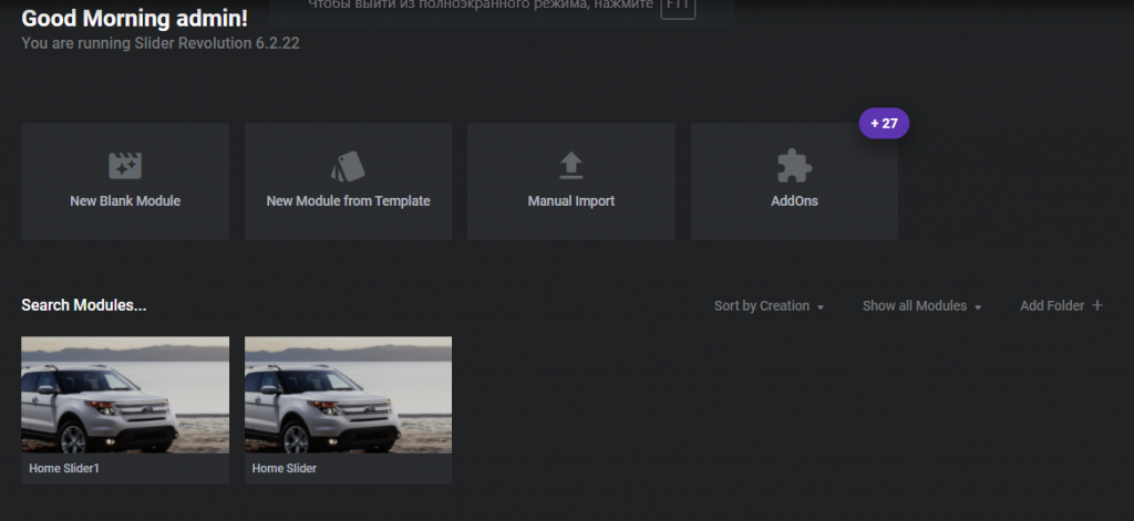
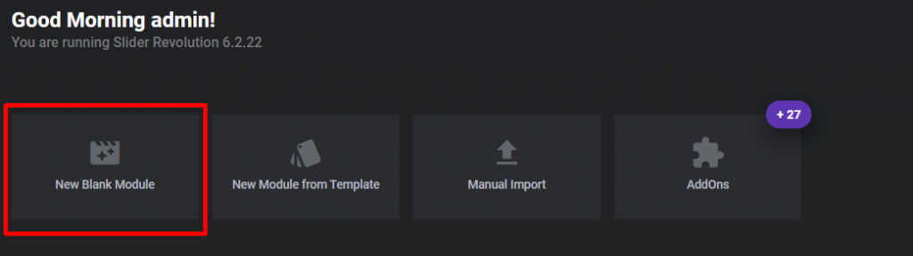
Creating a new slider
Now when we are done with some primary setups we can proceed to create a new slide. Open the Slider Revolution settings and click on the New Blank Module.

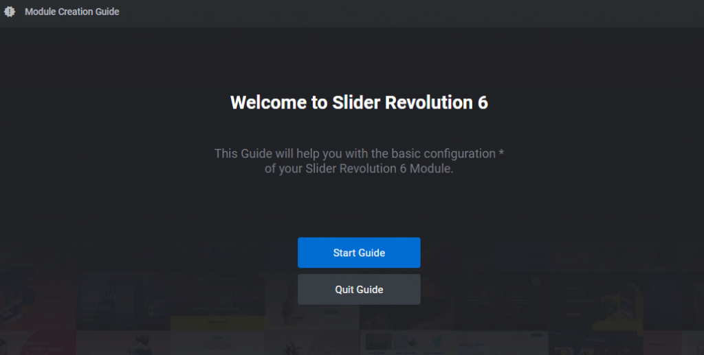

You will be offered to go through the quick guide. Click on Start Guide if you’d like to take a short lesson. Or quit the guide to skip this step.
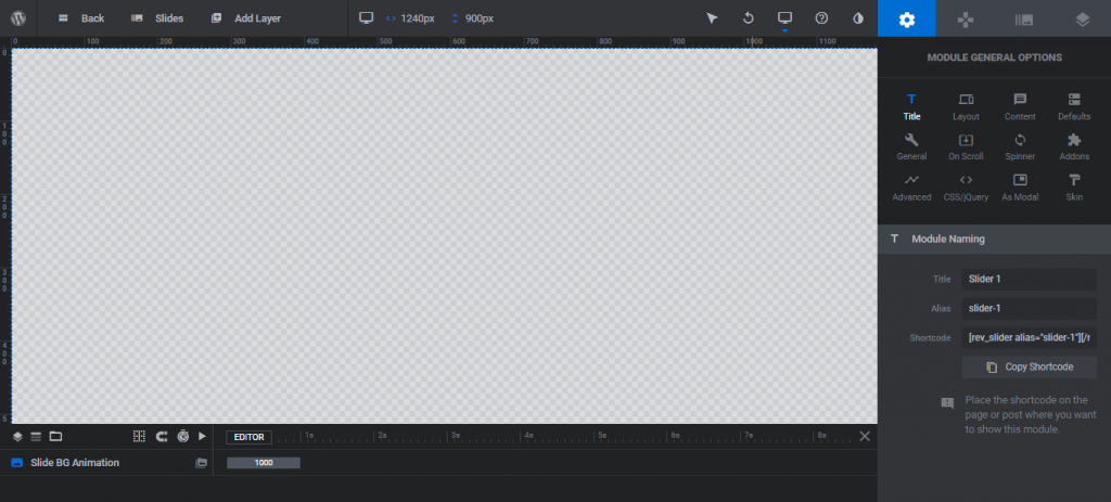
Your screen will be divided into several areas: from you left there is a frame where all the content is displayed, from the right — it is a working space with sections and settings.

General options
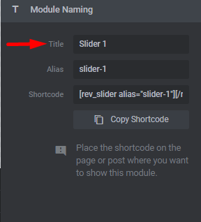
Let’s start with the General Options. Click on the Gear icon to open the settings. First of all, we need to name our module. In the Title section enter the name and duplicate it for the Alias in lowercase and with dashes between the words instead of spaces.
Alias is needed to add the slider to a page. You can also use the provided shortcode by copying it and placing it on the page or post you want to display your slider.

After that, we can customize the type and the desktop layer area height and width. These settings are located under the Layout tab.
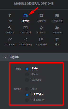


For the type you have three options to choose from:
- Slider — several animated slides that rotate to display one by one.
- Scene — a single slide that can be used as a content module.
- Carousel — many slides with multiple visible at the same time.
The next setting we need to specify is sizing. There are also three options available:
Auto — this is the default parameter that stretches your slider to the main container width as defined by your WordPress theme.
Full-width — a full-width slider option stretches across from left to right (you still need to define the height)
Full-screen — for large sliders filling the entire screen, no matter the size of your browser or device.
With the Slider Revolution plugin, you can animate every part of the page on the website. Please consider, when doing so the weight of your page will be increased and thus, it will take more time to load your page. As a result, it may negatively affect SEO ranking.
Resize settings
Classic or linear resizing makes sure that your slider will compress accordingly after configuring your main screen size settings (for example, a 1000x400px slider will compress to a 500x200px slider with the fonts, images and other slider elements).
Intelligent inheriting enable the automated device sizes creation based on the desktop settings you choose, with the option to adjust.
Custom or manual setup lets you set your slider size using exact pixels, with the ability to set the slider sizes at different screen width — desktop, laptop, tablet and phone.
Responsiveness of the slides
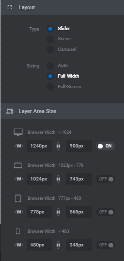
Moving on. We are not done with the responsiveness yet. There is a Layer area size where you can specify the browser width.
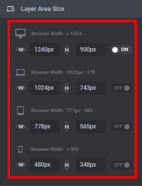

Usually, the options are set by default to Auto Sizes, and only the desktop parameters are specified. You can do the same for other options by switching them on.
Also, if you switch on the specific device, your working area (slide container) will be adjusted to the parameters of the selected device, meaning you can control the display of the slider for the concrete device.
For each device, there will be specified grid sizes from global settings. The grid is the area in which your slider layers are located. There are no strict numbers that you should enter. You will figure out what works for you best after you try and explore several options.
This was just the beginning, some general options that will ease your further work with the slider. And once you are done with this part you can switch to the next step.
A closer look at the options
Besides the General options, there are three other tabs you will be interacting with a lot. We want to guide you through the main settings you will be operating with. Basically, the creation of the slides considers several components that are involved in the process. These are general options, navigation settings, slide options, and layers.

We were not joking when saying Slider Revolution has tons of options. There are too many elements to cover, let’s slightly describe all of them and then review in a more detailed way the most important ones.
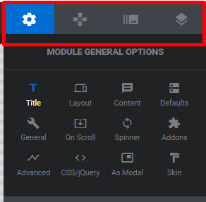
1. General options
We already touched on some elements from the General Options like Title and Layout. However, besides these, there are other things you need to adjust.
All in all, General options allow you to set up the following:
Title — to provide the slider’s name.
Layout — select the slider type (slider, scene, or carousel) and sizing (auto, full-width, or full-screen). This helps to edit the widths and heights for the layer area, the position of your module, a default background color or image, and more.
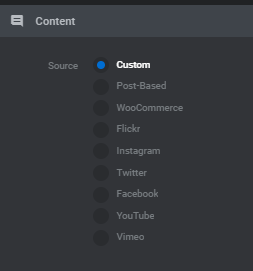
Content — identifies the way of adding the content to the slider. You can choose from 9 content sources.

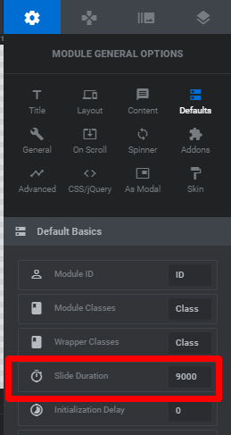
- Defaults — here we suggest concentrating on one important parameter — Slide Duration (how long each slide will last).
- General — this section includes slideshow settings for auto-rotate, stop on hover, looping slides, and selecting a designated first slide. Here also you can hide or disable your slider on mobile or under specified pixel widths.
- On Scroll — this one allows users to select scroll effects such as parallax, 3D depths, timeline, fade, blur, grayscale and more. All effects go with customizable settings.
- Spinner — or preloader, and the plugin has 15 spinner options to choose from.
- Advanced options allow you to enable lazy loading, select a fallback image, or simplify your slider on old browsers.
- CSS/jQuery — here you can add your own custom code to sliders. Note that this one is better to be used by professionals or users familiar with the concept of programming and coding.
- As Modal — this particular option is needed in case you want to create a slider that appears as a popup or lightbox and it provides you with the options for slider position, cover color, and the shortcode to use when inserting your modal slider in pages.
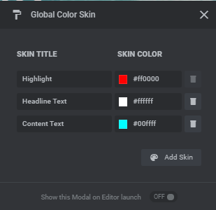
- Skin — skin presents the preset that you can create and assign to text layers (specifies the color of the highlight, heading, content text).

Addons — here you will find addons (note – addons are only available if you purchased your own slider license).
2. Navigation Options
If you are planning to include more than one slide, the navigation options will help you to add navigation tools to the slider such as bullets, arrows, and buttons.
All the options include easy to customize settings for position/alignment, sizing, visibility and global styling/presets.
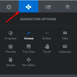

The Navigation elements include:
- Progress — progress bar or circle that visualizes current slide progress.
- Arrows — make it easy for visitors to click through your slides.
- Bullets — 14 styles of navigation dots to add to your slide.
- Tabs — very useful for content sliders where the tab navigation is needed.
- Thumbs — is required to display a thumbnail image as a navigation option. There are 5 options available.
- Prev Size — specifies the size of the preview image.
- Touch — includes options for block scroll, velocity and direction.
- Keyboard — you can enable keyboard navigation (recommended for accessibility).
- Mouse — enables the mouse control such as a carousel function or reverse scroll.
- Nav Editor — this section is for customizing arrows, bullets, tabs or thumbs with your own custom code.
3. Slide Options
The next part of the settings is related to the slide options.
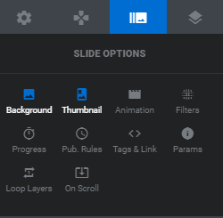

- Background: Choose the background for your slide. Choose from transparent, colored (you can add a gradient), image, external image, or a video (YouTube, Video or HTML5).
- Thumbnail: Define the thumbnail visible by the admin and the thumbnail used for navigation.
- Animation: Choose the transition animation for your slides.
- Filters — 22 of different filters to add to your slides.
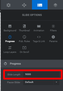
- Progress — allows customizing the slide length, pause, and visibility on a slide.
- Publish Rules — control whether your slide is published or unpublished.
- Tags & Link — helps to add custom class, ID, and HTML data for your slide as well as a link.
- Parameters — add up to 10 custom parameters to use within your slides and navigation.
- Loop Layers — manage loop settings if your slider only has one slide.
- On Scroll — customize your parallax and scroll effects per slide.
Adding new slides
After you finish setting the slider and adjusting all options, it is time to add a new slide to the project. You can see the frame, which displays the slide content when you add it. Now it’s transparent. You can change the background option and add an image or set the color.
You can upload an image from your computer, or use external source (by adding a link). Also, you are able to set the color as a background instead of an image. It can be done pretty easily.
Just select the Colored option from the Type dropdown in the Source panel, and then click the BG Color button to choose your color. If you want to use the video simply add the source.
Adding a new layer to the slide
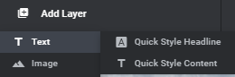
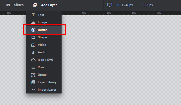
At the top of the screen, you will find the +Add Layer option. Use it to add a new layer to the slide. There are 8 different options.
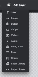

The most popular options, however, are images and texts with the support of buttons if you need to add some navigation tools to the slider.
Layer options: how to use
The flexibility of Slider Revolution is based on the availability of multiple options and the ability to set up every detail separately as well as adjust the whole slider project. Layers are not an exception. Every time you add a new layer to the slide, you can control every option for it. In the example of adding a new image to the slide, we will review all the parameters that layer options allow you to change.
When you want to add an image layer to your slide, simply click on Image in the Add Layer dropdown. Then upload the desired image.
Next to the frame, you’ll find various Layer Options (Content, Style, Size & Pos, etc.).
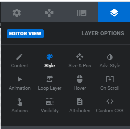

Layer Content displays some basic information about the layer. You can set lazy loading and change its source type.
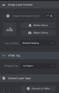

Using the layer Style options you will be able to add a color background.
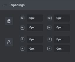
The next option is the Spacing. Spacing helps us move the layer from up to down, from left to right, from down to up, and from left to right. They are marked with the letter ‘M’.

Pos and Size. Set align as well as the position and size of the image layer. Both vertical and horizontal alignment can be changed easily, simply click on one of the alignment icons.
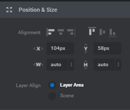
After that, you can set the position with Vertical Offset from Aligned Position options. Play with X and Y parameters to move your layer on the slide.


Layer Advanced Options
Advanced Style options allow you to Rotate a layer horizontally, vertically, and centrally and let you add shadows to the layers.
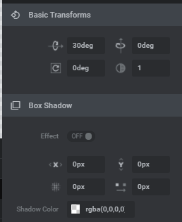
Layer Animation Options

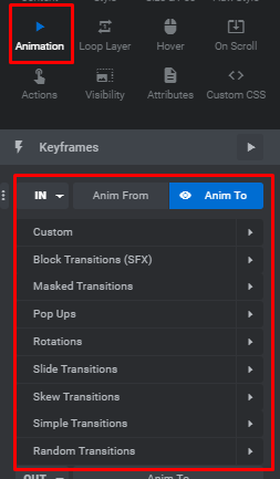
Animation is the major option in the Slider Revolution. The main idea of the plugin is to add to your site animated elements instead of static, standard visuals.
Animation options add motion to your slides, using this action you are able to animate the slides and set appear and exit animations.
There are two lines for appear and exit options: IN and OUT.
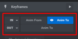

Each line is provided with a dropdown menu with different types of animations. By default, the fade-in option is set for all layers. Try some animations to see how it looks on your slide and choose the best one.

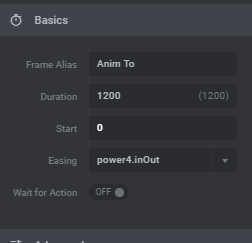
The section below is used for Animation Duration, Animation Easing, and for defining animation Start. The Duration defines how long it takes for the animation to finish, the Start option defines the duration of time after which the animation will start once the slide is loaded. Easing defines the speed at which the animation will progress.

Animation Timeline
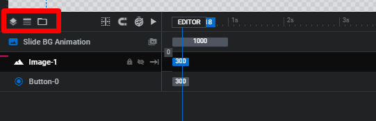
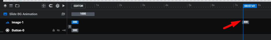
If you have multiple layers added to your slide, you probably do not want them all to appear at the same time. The Slider Revolution Animation Timeline can help you to handle this issue. It is located right below our work-frame.
The default frame start for each layer is set to 0 milliseconds, meaning that layers will appear on the screen after 0 milliseconds the is loaded. The appearing duration is usually set to 3 seconds which means that a layer becomes fully visible in 3 seconds. To change the options, choose the layer and edit it by specifying a different value.
Make sure you set different values for different layer, so they appear not at once and look messy.
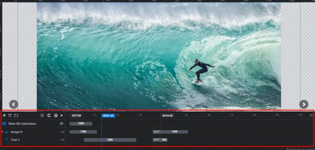

Now, let’s have a closer look at the options of Timeline
1.List View
These icons can be used in order to hide or show the Layers and hide or show the Rows based on the vertical alignment. Only the admin of the website has access to these options.

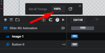
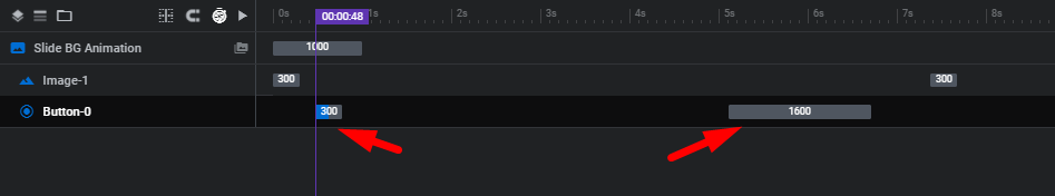
2. Timeline Duration
The Timeline total duration is defined in the Module General Options > Defaults. Also, it can be set individually in Slide Options > Progress.


By dragging the block in the Timeline left and right you can easily adjust the slide length. Another option you can do is to click the clock icon and edit it in percentage.


3. Preview Timeline
In order to Preview the timeline, you need to click the Play icon or simply drag the idle block.
4. Rename Layers
To rename the layer double-click the layer’s text in the Timeline and rename it. Also, you can edit the title of the layer at the top center of the Editor.
5. Layers z-index / Stacking Order
To set the z-index/stacking order you just need to drag layers in the timeline.
6. Animations
For every layer, there is an in and out animation and additional Keyframe animations. All the animations are presented in the timeline.

Drag an animation block to adjust the starting-point of animation in the Timeline. And edit the duration of the animation by dragging the endpoint of the block
Layer Loop Options
The Loop tab lets you create looping animations. You can choose an animation type, define the loop speed and easing, and set a start and end time for the loop.
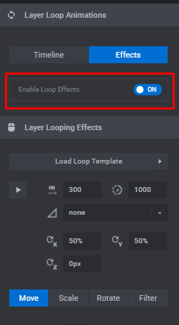

There are 8 types that you can choose from: Custom, Pendulum Loops, Effect Loops, Wave, Wiggles, Rotating, Slide and Hover, and Pulse. Each loop animation has its own set of options.
Pendulum makes your layer swing from side to side. Among the options you can set up is the end and start degree — this identifies the degrees between which the animation will occur, and X and Y origin point — this parameter determines the axis point from which the layer will rotate, you can specify it in percentages.
Effect Loops allows you to choose from several options — Grayscale, Blink, Flattern, and Lithing. All the effects look differently, so we recommend you look at every option to choose which one is best for you.
The Wave animation makes your layer rotate in a motion similar to the wave. It rotates around an axis outside the layer. You can set a Rotation X and Y Point to determine the position of the axis around which the layer will rotate, a Start Angle to identify the starting position of the animation and a Radius for the orbit of the rotation.
The Wiggle loop will make your layer wiggle from side to side – from up to down, from left to right, and vice versa. Use the dropdown to choose the option you like.
The Rotating loop makes your layer rotate around the set axis point. The layer will rotate and make a full circle if you choose the first item from the Rotating dropdown – the Rotate item.
To make your layer move left to right, right to left, up to down, diagonally, you can use the Slide and Hover animation. You can set a start and end position for the animation.
The Pulse animation makes your layer continuously zoom in and out. Specify the Zoom Start and Zoom End. The default values here are 1 for both start and end. This means that the layer will remain at 100% of its size. In other words, it won’t animate. If you enter 0.5 for the Zoom Start, your layer will start at 50% of its size and zoom in to 100% of its size, then back to 50%, etc.
Layer Hover Options
Hover effects are the staples of good UX. Hover effects usually indicate that the action is required or performed, especially since this method is actively used with the sliders. With the Slider Revolution, you can make layers, texts and images change on hover.
Adding Hover Effects in Slider Revolution
First, you need to turn the layer hover on. Select the layer you want to add the effect to, and, click on Hover under Layer Options. Click on the Enabled to turn it on.
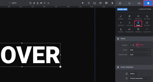

In the neath, you’ll find all the options you need for setting your layer behavior on hover. If you leave all as it is, the layer will not show any changes.
Hover Settings
The first thing you can set here is the Cursor. In the dropdown menu, you can find different options for the Cursor. Auto and Default perform the same functions and will not reflect any difference. The Crosshair and Pointer define the shape of your mouse cursor on the screen.
There are even more cursor styles here. Some of them are pretty unusual, however, most of them indicate the action the layer has when triggered. For instance, if you are linking the layer to the Support center you can choose the Help cursor.
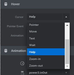

Pointer Event by default is set to Auto. None option is used when there is no linked content. This section allows you to choose the Cursor look on layer hover, enable animation, and set it up.
Hover Animation
Next, there is a Hover Animation which you can set depending on your preferences. There are several things you should be aware of. First, it doesn’t look good when the layer changes on hover and the transition happens at a moment. Always better when the transition happens with the delay. . By default, the delay is set to 300ms, leave it like that if that suits you, or change the value.
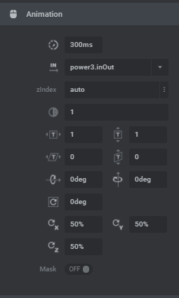

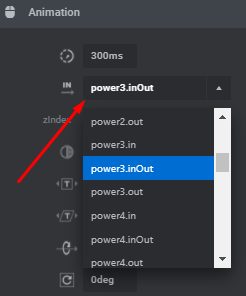
Also, you can set the easing for the transition. You have several options to choose from.

Filter
To your layer, you can add Filter. In other words, you can blur up the lyre to a certain extent. The option is expressed in pixels. The higher the value, the “thicker” the blur.
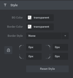
Style
There is also a Style part where you can set up the background color and adjust the border, namely change their color and select the border style.

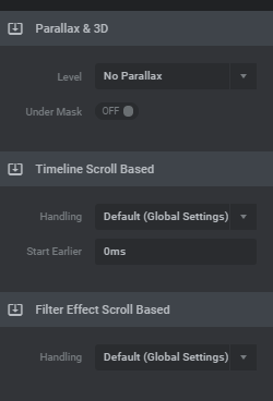
On Scroll Layer Options
On Scroll options make it possible for the slide to move on mouse scroll. There are three options – Parallax, Timeline Scroll Based, and Filter Effect Scroll Based.

Layer Action Options
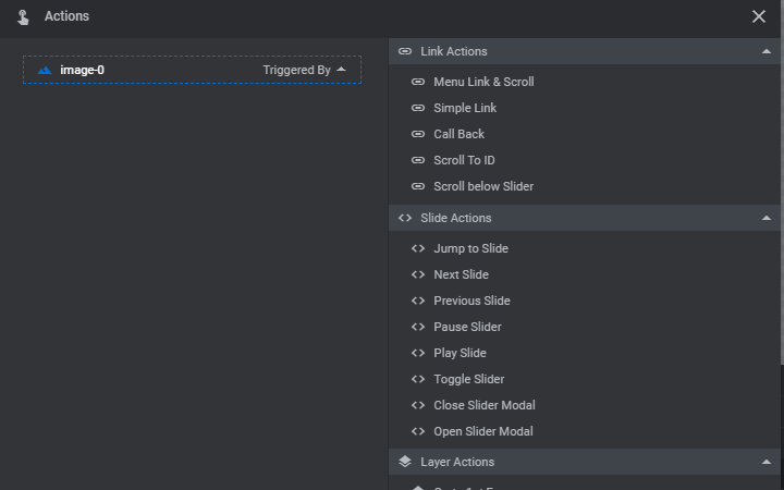
Actions make your layers interactive. For example, you can make a layer open a link when a user clicks on it.
Click on the Action icon to choose the type of action you need. The first dropdown is where you can choose the type of action that you would like to occur. There are a lot of options here: Link Actions, Slide Actions, Layer Actions, Media Actions, and Fullscreen Actions. Your chance is full depends on you and your goals, whether you want the layer to open the link or to switch the slide.

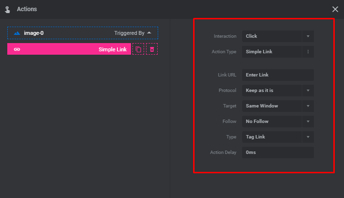
After you made a choice of what action to add, you need to set this particular option. For example, we are going to add a link. Select the option of Simple Link, and on the new screen, you will be offered to enter some parameters such as the URL itself, selecting the interaction and action type, and more.

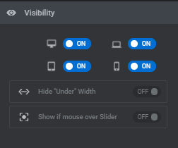
Layer Visibility Options
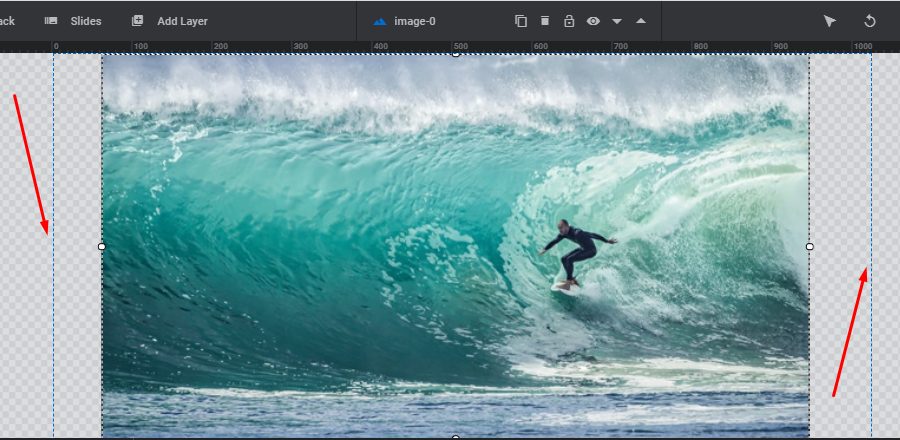
If you want your layer to be visible on all devices, then make sure the switches shown in the image below are all turned ON under the Visibility section. The first one is for desktop, the second one is for laptops and horizontally oriented tablets, the third one is for vertically oriented tablets, and the last one is for mobile phones.
If you don’t want your slider to be shown on some devices, simply turn off this option.

Text layer
After we review most of the options that we need for the layer setup, let’s move to the other type of layer and try to add some text to our slide.
There are two options to choose from Quick Style heading or content. The main difference between them is pre-styled options.

Let’s just point out some primary options you need to set for the text layer. They are the following:
- In the Content section, we add our text, and aligned it.
- In Style changed the font and its size, weight, line-height
- Customized the Size & Pos to change the location of the layer within the slider
- In Animation, we add some effects and speed for our text.
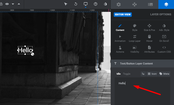
When adding a text layer there will appear a black box. You need to enter your text there. Everything you change will be visible in your work-frame.
Moving on to the Style tab. By default the font style that is applied to the text is Roboto. Choose the font family you prefer from the dropdown. Make sure that you selected the text layer before you start editing it.

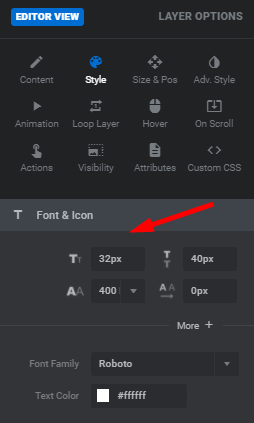

Besides choosing a font family, you can also determine the font-size, line-height, font-weight, and letter spacing here as well. All these options adjust the look and feel of the text. So take your time to set it up and play around with these options to find the best combination.
Next, choose the color for your text. You can use the color picker and find the color that suits your page and slide perfectly. After that, you can save the change and see how the slider looks on your page.
If everything is good, you can move to the next step which defines the horizontal and vertical alignment of the text layer. For instance, you would like to have your text layer start 300px from the left edge of the screen, and 100px from the top. According to this, the horizontal alignment will be set to left, and vertical alignment to top. Fill in the X and Y fields respectively and save the changes to check how the text looks.
For customizing options you can use the same options we went through during the image layer setup. You can add animations, define visibility, create actions, etc.
You can also input HTML code into your text layer field. Thanks to this option, you can insert different shortcodes and create your own HTML elements using text layers.
How to create a parallax effect with slider revolution
Parallax is one of the most popular effects that make s the website more impressive and dynamic. You have probably seen lots of websites and themes integrated with that particular effect. And now we are going to show how you can build one on your own using the Slider Revolution plugin.
What is Parallax?
The parallax effect can be defined as an effect where elements in the background and the elements in the foreground, move at different speeds and create the illusion of depth. Usually, the elements of the background move slower
There are different ways of how you can achieve this effect on your website. Luckily for us, the Slider Revolution has all the functionality to help you achieve the parallax effect.
Creating Parallax in Slider Revolution
First turn the parallax on. Go to Module General Options > On Scroll > Scroll Based Features > Parallax and turn the Parallax Enabled switch to On.
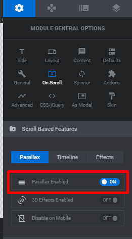

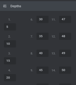
There are a lot of various depth values that the plugin offers. Select the one that is best for you. You can also enter your own values.

Adding Parallax to Background Images
To add the parallax effect to your background image, go to Slide Options > On Scroll > Parallax & 3D Settings, and choose the preferred depth from the dropdown.
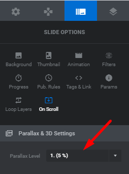

There are strict rules when selecting depth. It is better if you try different values and see which one works better with your slider. Different depths directly affect and create different effects. That is why we recommend you try them to see the result.
Adding Parallax to the Layers
In the Slider Revolution, the parallax effect can be added not just to the background images but to the individual layers as well. What is great about this effect is that it gives users an illusion if they control the parts of the slider on the page just by moving their mouse. This looks really nice on the website and what is more, it’s very easy to set up.
Select your layer, go to the Layer Options > On Scroll > Parallax & 3D tab, and choose the desired level of depth.
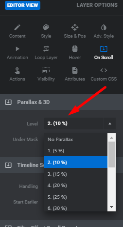

As the result, you will get the layer with parallax that activates on the mouse movement.
Whether it is a background image or an individual layer, adding the Slider Revolution parallax effect is extremely easy. Although, not every slider needs parallax. Use it mostly for simple sliders, as the dynamic ones with lots of animation will probably do better without this effect.
Adding a Button Layer
With the Slider Revolution, you can create and design the button to add to your slider for navigation. To do so, first, we need to add a button layer to the slider work-frame.

When you add the button it will appear in the text form, you just need to customize it. On the right side of the screen, you can find lots of options for predesigned buttons. You can select one of them for your button.
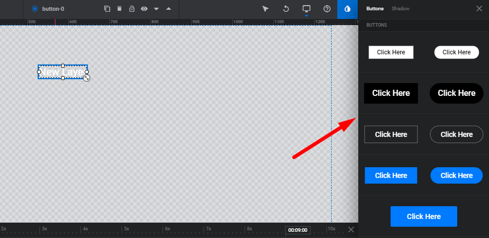
Moreover, you can go with something original as there are variations of play buttons, switchers, and others. Also, it is possible to add a shadow effect and make the button look more interesting.

Once you chose the style, you can change the advanced settings and customize its look. All the settings can be found under the Layer Options tab.
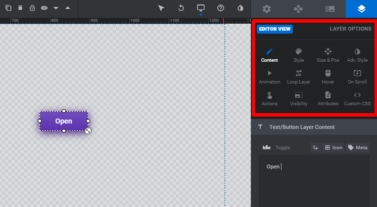
You can change the initial look of the button, change the text, change its display on hover, and set up animations.

How to make Slider Responsive
In the very beginning, we have already set up some parameters to make our slides responsive. That is not enough. For that, you also need to make sure that each layer in each of your slides seamlessly adapts to all devices and screen sizes.
So, once you add all your slides and layers to your slider, it’s time to fine-tune them for all the other available devices.
When editing slides in the work frame, you’re primarily setting them up to look good on desktop devices. When you’re certain everything looks perfect on desktop, you can start playing around with layouts for other devices.
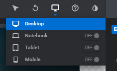
Now you can choose the device you would like to emulate from the dropdown. Turn on the device you want to check the display of the slider. Available devices are: Desktop, Notebook, Tablet, Mobile.

You can modify everything for every single device. For example, for text layers you can set different font size, line-height, font-weight, and color, all depending on the device your slider is viewed on. For the image layer, in order to change the size of it, you need to add a different width and the height of the image will be adjusted automatically according to the width.
Pay attention to the blue grid borders. These define the edges of the device you are currently working with. So, if any of your layers extend outside of the borders, make sure to change the settings for those layers.
Finally, save your slider, and check out how it looks live.

Adding the Slider to the page
You have done a good job and now it is the time to see how your slider looks on the page. To do so use the Slider Revolution shortcode that you created earlier. This shortcode can be found under the Title tab of the General Options section.
Or if you open Slider Revolution from your dashboard. Find the current module and select the option Embed.
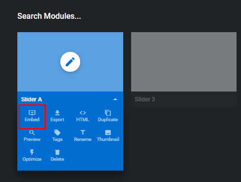

In the pop-up window select the option For the pages and Posts and copy the shortcode.
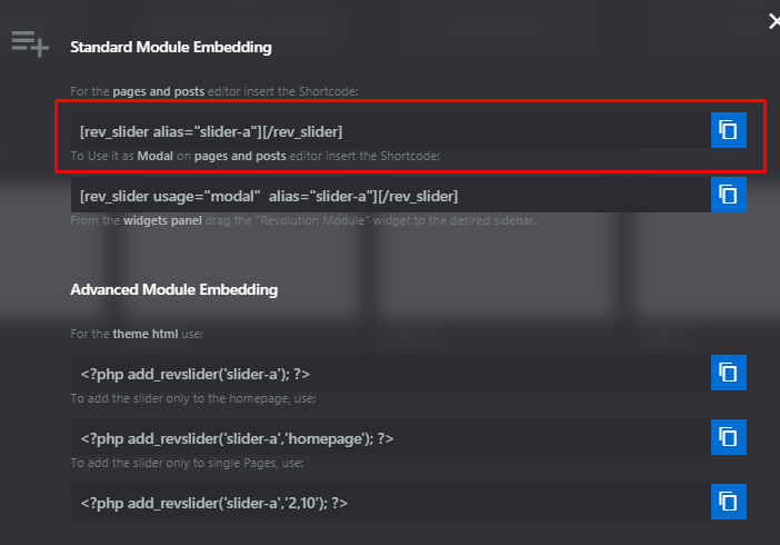

The shortcode should look like [rev_slider alias=”title”][/rev_slider] with the “title” based on the alias you gave the slider.
Displaying Slider with Elementor
Using the shortcode method to display the slider on the page is simple enough. However, there is a way that could be even easier. All the sliders you build with the Slider Revolution plugin can be inserted on the page using the Elementor widget. Select the page you want to display the slider on and open it via the Elementor editor. Then simply drag and drop the element onto the working frame. On the widgets panel, search for the Slider Revolution 6 widget and add to the page. When you drag the widget you will need to choose the slider you want to use.

Use this way as an alternative to shortcode, as some website owners find it easier working with page builder widgets.
How To Export Sliders
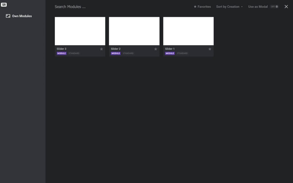
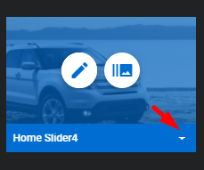
To export the slider go to Slider Revolution by clicking on the relevant tab from your dashboard menu. All the sliders you have imported or created will be displayed there.

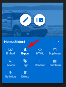
Mouse over the thumbnail of the module you want to export. Click the small arrow in the bottom right corner. Among all appeared options select the Export and click on it.


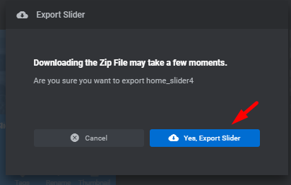
You will see the confirmation dialog which will notify you that the export may take some time. Click on ‘Yes, Export Slider’ and the download will begin. When the downloading is finished, you will have a .ZIP file of your slider.

To conclude
Almost all the themes developed by StylemixThemes include the Slider Revolution plugin in the package. We love this powerful software that gives us a chance to make websites more appealing, attractive, and interactive.
We hope our guide helped to understand better the process of building the slider with this amazing plugin. If you are looking for more information please follow the main page of Slider Revolution.