
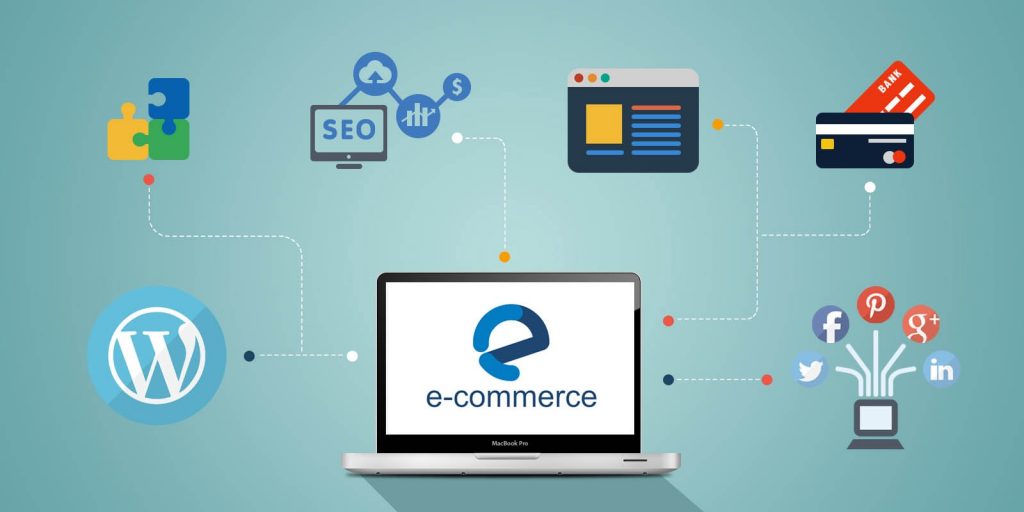
Soon enough, the world is going to be doing most of its shopping online, in one form or another. There is no denying the immense growth of eCommerce, but with growth comes challenges and responsibility, too. In a world where anyone can pretend to be someone else, it’s crucial to build a site that stands out. A site that provides a sense of trust through clean and understandable design. When your attention is focused exclusively on selling the product, you forget that in order to sell the product — first, you must make a good impression.

The design of any site, and eCommerce, in particular, plays a significant role in earning users trust. Besides design, you also have product quality and content quality that entices customers to make a purchase. So, it’s not hard to see how big of a role design plays in eCommerce site design. One thing to remember is that your customers are also browsing other sites. And other sites leave an impression. If they found one experience to be pleasant and seamless, it’s more than likely they’ll seek a similar experience (UX/UI) on another site.
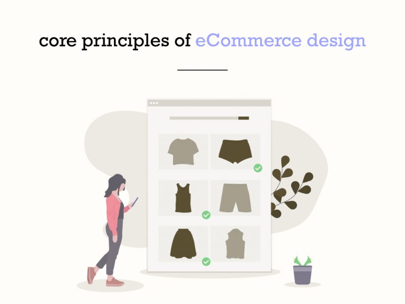
What are the core principles of eCommerce design (web/mobile/app):
- Simple to use. Actions feel honest and to the point.
- An excellent brand image presentation. The design is complemented with elements that make up for a strong brand presence.
- Emphasizing security measures through various forms of badges, trust signals, and other types of security-related efforts.
- Visual content used in a way that doesn’t intrude the user experience. Designers need to be mindful to use visuals in moments where they add the most value.
- A clear structure for site navigation through breadcrumbs, menus, and links found throughout the design.
- Quickly accessible business information; contact, address, etc.
- Design structure which helps to sell the product or products, rather than casting a shadow over them.
These would be the principles that you need to follow whenever you’re creating a new eCommerce site but are just as useful to apply to existing store design. Similarly, we recommend checking out interesting eCommerce designs for inspiration; to see what other designers are doing. And once you have the basic understanding, you can start focusing on cultivating results.
What are the latest trends in eCommerce web design?
We all know that there are billions and trillions in eCommerce money sitting on the table. This is not news. Just knowing something isn’t going to make a difference. What we need is a clear path towards action. Thus, our roundup of the latest trends for eCommerce design. This list takes into consideration the most prominent trends over the last year, and also new and emerging trends that have a promising future.
Whether you have built a hundred sites before or this is going to be your first one, rest assured that these tips and trends apply universally. There’s a lot to look forward to in 2019, especially in areas like animation, performance, machine learning, and automation. Big brands are trying to squeeze every ounce of breath from the small players. And the question is, will you let them or will you show them that you can keep up.
Put a stamp on it (branding!)

Businesses are taking note that the traditional methods of marketing are no longer cutting the bacon, so to speak. Rather, there’s an emphasis on embracing branding, and cultivating a brand-like presence opposed to hit and miss clientele. In simple terms, be willing to take risks with letting the world know about your products. If you’re solving a problem better than everyone else, make it clear in your marketing messages and social media. Remember to retain a consistent brand image, with the inclusion of brand-related promotion across all your channels.
Embrace social shopping
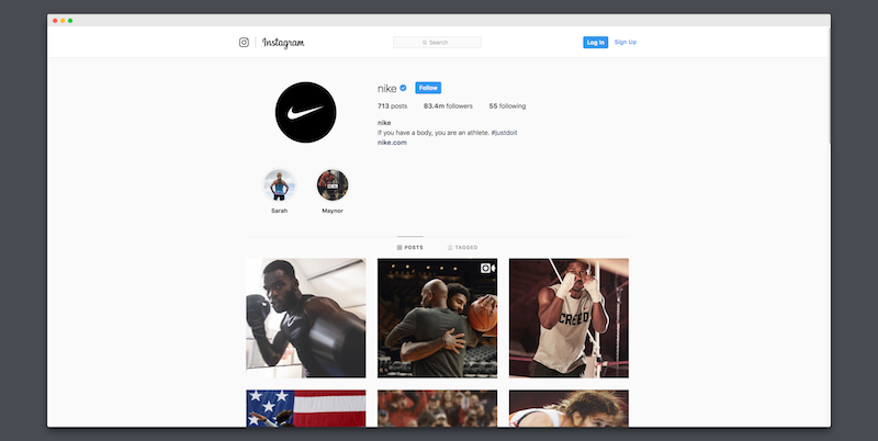

Instagram and Pinterest continue to grow as social media begemots. But one thing that marketers ought to take note in 2019 is that both platforms act as storefronts by themselves.
Instagram reports that there are more than 200 million users who check a business profile on .a daily basis. Further, up to 60% Instagram users say they’ve discovered a new product right there on the platform.
If you want to take full advantage of this highly emerging trend, be sure to consider signing up for a business account on both Pinterest and Instagram. There’s no doubt in anyone’s mind that both social platforms want to streamline the shopping experience for their users. Meaning, getting users to purchase your products without having to leave the platform.
Fine-tune your performance
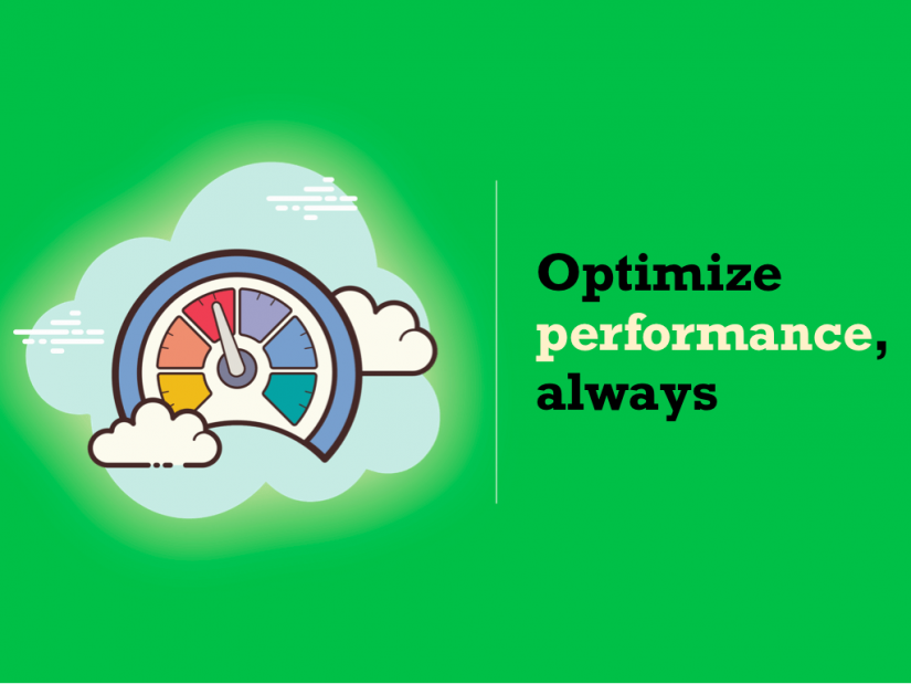
Performance is closely tied together with user experience, so you’re going to have to keep innovating with ways to shed off those precious milliseconds from your loading times. You can invest $100,000 in a sleek professional design, but if that thing loads slower than 2-3 seconds at most; you are wasting money and resources. Consumers want quick load times, and quick checkouts.
But, performance is also a huge topic. There’s front-end performance, and back-end. Also, you can optimize for the client and the server. If you’re dealing with a WordPress (WooCommerce) site, then we have a few articles of our own to recommend. I wrote a detailed guide on how to optimize WordPress for speed, and also a dedicated tutorial for how to optimize your images for best performance. And one of our other writers shared thoughts on WordPress database cleanup and optimization. These should get you far enough to cover modern performance requirements.
If you would like to take it a step further, here’s a few articles that might help you out.
- Front-End vs. Back-End Performance
- 12 Simple PHP Performance Tuning Tips
- Apache2 and php fpm performance optimization — Step-by-step guide
Become the user
One of the design areas that’s often overlooked is the process of turning yourself into a site user. Can you wholeheartedly say that everything on your site is flowing dynamically and without effort? How fast can you find a specific page and perform an action? You can go as far as comparing your site with another established eCommerce brand. What are other brands doing that’s making their onboarding process so simple?
But if you feel like your personal judgement is poor, experiment with services like UsabilityHub’s 5-second UX test. The five second test is essentially a way to measure first impressions for product pages and other parts of your site. Afterward, you can categorize feedback based on a criteria that either matches your expectation or doesn’t.
Despoil the checkout process
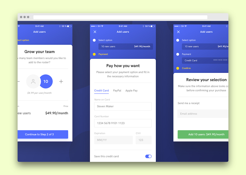

Getting the checkout process right is crucial for your success. And despite such emphasis on checkout importance, brands continue to pour their focus on UI rather than the UX. A good UI will steer customers in the right direction, but it doesn’t always guarantee a sale. And all eCommerce owners known that abandoned carts is the most dreaded metric in the game.
Even though a lot of eCommerce platforms are getting better at providing smooth checkout, there’s still room for improvement. Public surveys and case studies report that there’s an average of 75% cart abandonment rate. That’s billions of dollars going down the drain every single year. Whether all of those sales can be recovered isn’t clear. But rest assured that a lot of them can be.
Why are customers abandoning their carts?
- Complicated payment processing process. Generally, users prefer a simple (guest) checkout option wherever possible.
- Shipping and other fees are too high. Solve this by giving users incentives to spend more at the expense of you offering free shipping.
- Lack of trust. Are you ensuring that your payments are secure? Look into payment gateways like Stripe and Braintree.
- Delivery timeline. Orders that take weeks or months to deliver is going to scare customers away. They want their products asap!
- Broken site. Use automated testing tools to continuously check your site for errors and other issues.
It’s not guaranteed that you’re always going to hit the sweet spot. But, preparing for the worst case scenario can help to shift the lever in your favor. Check out this roundup from Trellis to yield some inspiration on butt-whooping checkout pages!
Image quality makes a difference

In most cases, a photo is the only means for a customer to experience a product. Yet, many eCommerce stores avoid using strong photography altogether, only adding pictures for product pages. While this traditional approach works, there’s an increasing amount of platforms experiment with new ways of photographic exposure.
For example, Bellroy is using a combination of animated elements in tandem with video previews. This helps customers to get a true feel for the product they’re considering to purchase. Furthermore, visual previews eliminate the need to ask for big questions. In turn, your support department has fewer tickets to worry about.
At the same time, don’t flock to stock photography sites to get your interesting hero shots. Chances are, users have seen those photos previously, and it’s only going to leave a poor impression. Instead, invest the money to hire a professional photographer to take care of business for you.
Can users trust you?
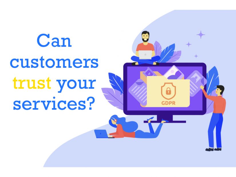
One of the things we have to adapt to is the fact that real people are giving us real money. So, it’s only fair the initial exchange is seen with some level of skepticism. There’s honestly more than enough scams out there to make people wary of whom they give their money to. Fortunately, you can still earn users’ trust if you’re being sensible with your design.
First and foremost, it is important to design a website that shoppers feel they can trust. Most shoppers are concerned about privacy and whether the site will protect their personal data by providing a secure transaction. If the website does not feel trustworthy, they will simply choose to shop elsewhere.Yej Lee https://medium.com/@yejinland
Most web users are quite adapted to the digital process, so promoting trust signals isn’t as difficult. Remember, it’s not how many people got to see your product, it’s how many people bought it.
Here’s a list of trust signals that most customers will look for on any given eCommerce store:
- Clear business information. General information like About, Mission, and Vision pages. Team members section to display photos of the actual people running the store. Accessible contact details, both on the header and footer sections. Social media links and widgets. And a dedicated FAQ section that can answer pressing questions without having the user reach out to you.
- GDPR and other privacy things. Are you compliant with EU’s GDPR rules? Make a clear statement. What about your policy for shipping orders and returning them? How can customers return a product they didn’t find as promised? Do you have a privacy policy that explains how you handle customer information?
- Promote real reviews. Preferably case studies or even video reviews if possible. Potential buyers love to learn whether a product fits the appropriate description, and does what it says it would. And reviews are the quickest way to learn. An honest review will do all the hard work for you.
- Trust seals. VeriSign, PayPal, Authorize.net, McAfee and other service providers have what’s known as a trust seal. Such seals are most commonly used to verify that your store is indeed using legitimate payment processing services.
- Predictable design. This has mostly to do with good housekeeping. Have you proofread all your copy? Do you use external software to check for broken links? Are your 404 pages optimized for easy redirects? Little things like this can and will have an impact on user experience. Since it’s something you can prevent from happening naturally (dead links or typos), you ought to maintain a pleasant UX.
Do you have more things to add to this list? And have you come up with other unique ideas to cultivate user trust using only web design? Share your feedback in the comments.
Accessible navigation

Success in design is hardly ever measured by the quality of particular visuals. Rather, all eCommerce stores rely on some simple metric; how many product units you have shipped. With that said, even the crappiest design in the world could outperform you, if it manages to bring in more sales.
And if users aren’t making purchases, then you have to dig deep to find answers on the reason. More often than not, the reason is the lack of clear navigation. Sloppy and counterintuitive navigation is the same as browsing a grocery store with all the labels mixed together. You wouldn’t want to go to the ‘Grains Isle’ only to find it’s full of sweets and chocolate.
Users should always have clear answers to the following navigation questions:
- Who is the brand behind this product and/or store?
- Which page is currently being browsed.
- Can the menu be accessed quickly?
- How to get back to the previous page, or, how to get back to the homepage?
- Where is the search function located?
- Are there any customer reviews I can preview?
- How to contact the support department?
- Is it possible to save items for later purchase (wishlist)?
The eCommerce landscape is getting saturated fast, which means that users don’t have time to waste with poorly designed sites. Emphasizing the simplicity and intuitive design of your navigation is not only a trend to embrace, but a practice to employ as the foundation of great user experience.
Here are some inspirational links to get your creative juices going:
- 11 Great Examples of Ecommerce Navigation That Can Improve Sales
- How To Improve Your Navigation For Better eCommerce UX & UI
- 100+ Beautiful and Creative Ecommerce Website Designs
Final statement
Whatever you’re working towards in 2019, make sure you’re always experimenting and trying out new things. Different niches have different audience types, and so the expectations change rather quickly. Being able to adapt to new and innovative things is also a huge plus. Don’t just wait for popular design blogs to write case studies, but go directly to the source. Bookmark sites like Dribbble and Behance and see what kind of design trends are emerging. As long as it’s improving the overall user experience, it can’t hurt your bottom line.
Speaking of bottom line, keep an eye out for cryptocurrencies and other emerging fintech markets. Being an early adopter for these intricate technologies could have a huge impact on your sales.
All in all, things are looking promising for eCommerce business owners. Now, tell us how are you going to continue growing your brand presence in 2019? Are you planning to make major changes to your platform? Perhaps you’re inspired by one of the trends listed in this post. We’d love to hear from you.